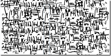
Lettering designs
The purpose of this chapter was to explore different styles of lettering, and the patterns that can be made with them.
I started by choosing a word, “writing”, and representing it with different drawing tools and different ‘styles’ of lettering. These are shown below.
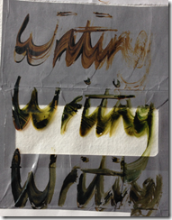
 Image 2.1: ink on telephone directory applied with pipette and paint brush
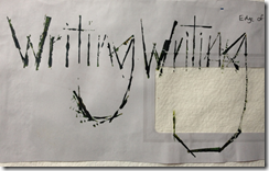
Image 2.3: ink on envelope packet applied with bamboo dip pen and twig
Image 2.3 – bamboo dip pen made fresh from the garden!
Image 2.4 – ink on envelope lining applied with various calligraphy nibs
Image 2.5 – ink applied with spatula, end of paint brush, edge of credit card and end of paper clip
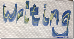
Image 2.6 – ink applied with edge of card
Image 2.7 – ink applied with rubber
Image 2.8 – ink applied with end of coiled card
Image 2.9 – ink applied with edge of card
Image 2.10 – ink applied with toothed card and edge of card
Image 2.11 – ink applied with edge of credit card
Image 2.12 – telephone directory page covered in Quink. Bleach applied with bamboo pen, end of paper clip, credit card edge
Image 2.13 – page covered in Quink. Bleach applied with toothed card and edge of card
Image 2.14 – Quink applied with edge of card and bleach applied on top with bamboo pen
Image 2.15– page covered in Quink and placed over metal mesh. Oil pastel used to writ so that rubbing of the mesh showed through.
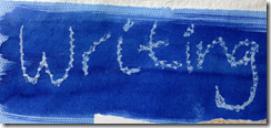
Image 2.16 – PVA glue squeezed from a snipped corner of a bag and allowed to dry. When dry it was coated with walnut ink.
Image 2.17 – PVA glue squeezed from a snipped corner of a bag and whilst wet, ink was dragged through the lettering. When dry the page was flooded with water and ink was dripped on to it.
 Image 2.18 – various coloured felt tip pens, different sizes writing in horizontal and vertical lines.
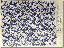
Image 2.18 – blue felt tip pens, same size writing in horizontal, diagonal and vertical lines.
Image 2.19 – large writing in oil pastel, then painted over with Quink so that the pastel acted as a resist, then writing on top in oil pastel.
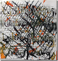
Image 2.20 – page covered in Quink, then writing in bleach, then writing in 8B pencil and ink with bamboo pen.
Image 2.21 – writing in blue and black ink using toothed card, then gold lettering on top
 Image 2.22 – page covered in Quink, then writing in bleach using an twig and oil pastel rubbed over the top
Images 2.23 and 2.24 – felt tip with various sizes of lettering. 2.24 is the same image with doodling added.
Image 2.25 and 2.26– writing applied with pipette then dragged with the edge of a card, then silver pen on top. Image 2.26 is the same image with doodling added
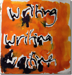
Image 2.27 and 2.28 – writing applied with pipette then orange dye paint was added and allowed to bleed into the ink. Image 2.28 is the same image with doodling added
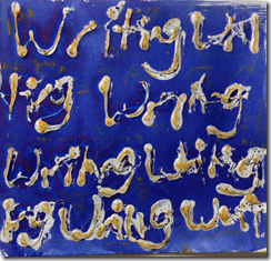
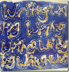
Image 2.29 and 2.30– writing applied with a hot glue gun and allowed to dry. Quink applied on top and then oil pastel rubbed over it. Image 2.30 is the same image with doodling in bleach added.
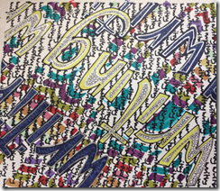
Image 2.31 – strips of envelope lining glued to the page and rows of lettering in various felt tip colours added to create bands.
Images 2.32 – 2.35 below were all created by rubbing oil pastels over the hot glue lettering (2.29) and then added diluted ink over the top.
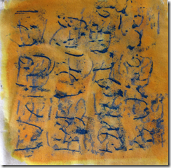 Image 2.32 – rubbed once in one direction and then at 90 degrees to the first rubbing
 Image 2.33 –rubbed in various directions overlapping
 Image 2.34 – three rows in different coloured pastels
 Image 2.35 – alternate rows – one row the right way up and the next upside down.
Creating patterns from lettering on a computer
I started by creating a block of text using the Paint function in Microsoft Office. I wrote ‘writing’ once and then copied and pasted it several times to create the block shown in image 2.36
 Image 2.36 – starting text block
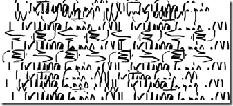
I then altered it by selecting sections to cut, copy and paste in different positions. I also rotated, enlarged or reduced the copied sections. The images below show the various stages of transforming the original block.
Image 2.38
Image 2.39
Image 2.40
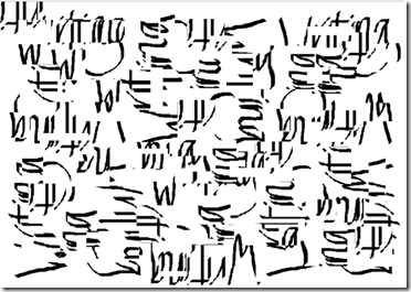
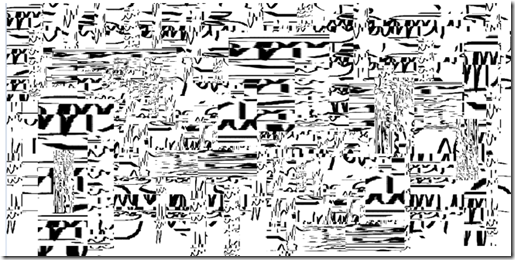 Image 2.41 – the final abstract pattern
I am very pleased with this final result. Whilst it isn’t obvious that it has been created from lettering, it certainly suggests text in certain places. The sections where the text has been reduced seem to give an impression of Islamic lettering.
Images 2.42 – below show another series using a similar process. In this series I created an abstract block as shown in image and then wrote ‘writing’ on top of it and then manipulated it further.
 Image 2.42 – starting text block
Image 2.43
Image 2.44
Image 2.45 – abstract pattern with lettering added on top
Image 2.46
Image 2.47 – the final abstract pattern
I have really enjoyed this chapter and am pleased with the variety of lettering styles that I have produced. Having enjoyed the messy part, using inks and different drawing implements I was not looking forward to the computer drawing. However, I am now a convert…I am very impressed with the abstract patterns that I created in this section.


