Module 1 – Chapter 7

Translating the bonded patterns into stitch

Having spent so many weeks using paper, inks, paints and bonding mediums I was looking forward to this chapter to do some stitching.

First of all, my rejected attempts…

IMG_4490[1] Image 7.1

Image 7.1 shows some of my first attempts at three-layered cut-work.  For various reasons I was not happy with these samples and so have not included them as my six samples.

Top right : Example made of a base of glazed cotton and two layers of lining fabric with machine stitching.  I didn’t like the lack of variety in the textures in this example as the fabrics and machine stitching were all quite flat.

Right centre: Example made of silk base with crosses cut from two layers of lining fabric with hand stitching in perle cotton.  This had slightly more texture due to the hand stitching but was still uninteresting due to the choice of two fabrics with the same finish.

Bottom: silk base with two layers of voile and machine stitching.  This produced an interesting effect as the voile allowed the stitching of the bottom layer to show through.  However, I rejected this sample as I somehow distorted the shape and it ended up not being square.

Left centre: sample made from quilting fabrics in blue and gold colours.  This example didn’t really fit with the brief for this module, I just wondered what it would look like in quilting fabrics.

Top left:  This example had a silk background and first layer and the top layer was made of voile.  It was hand stitched in perle cotton.

Six samples

Having worked out what didn’t work in the examples above, I then created six which I was more pleased with.

IMG_4502[1]IMG_4504[1]

Image 7.2                                                Image 7.3

In example 7.2, I used a background of raw silk.  The layers were made from purple voile, using the patterns shown in Image 7.3.  I hand stitched using a pale blue perle cotton in a running stitch and then twisted the same cotton through each stitch to make a continuous line.  I was very pleased with the effect that the two layers of voile created i.e. darker sections where the layers overlapped.

IMG_4503[1]IMG_4506[1]

Image 7.4                                              Image 7.5

In example 7.4, I wanted to create a more textured piece.  I used a square of muslin which I had dyed blue with Brusho ink as the base.  The first layer was made from raw silk.  I did two rows of machine stitching around all of the edges and then frayed the silk edges.  For the top layer I used another square of the muslin dyed a slightly darker blue.  I hand stitched two rows of running stitch in navy perle cotton.  To give the piece more texture I then cut out both sides of the stitching and frayed all of the raw edges.

I was really pleased with this sample as there was a variety of textures from the silk and matt fabrics and the fraying on the raw silk added interest with the warp and weft threads being different colours.

IMG_4476[1] IMG_4505[1]

Image 7.6                                               Image 7.7

In example 7.6 I decided to use the same pattern for both layers, with the second layer rotated 180 degrees.  I used a background of yellow lining fabric.  Layer one was made from a kingfisher-blue raw silk and hand stitched with a variegated blue/lilac perle cotton.  For layer two I used the same pattern but rotated it 180 degrees and cut it from purple voile.  For both layers I used running stitch with thread run through each stitch to create continuous lines.

I was very pleased with the finished effect.  I think the combination of the asymmetrical pattern used twice, the contrasting colours of yellow and blue and the ability to see the stitching on both layers due to the transparent top layer produced a very interesting piece.  It looks much more modern and abstract than the previous two samples above.

IMG_4482[1]    IMG_4519[1]

  Image 7.8                                                   Image 7.9

For example 7.8 I used a blue cotton background.  Layer one was made from blue ‘bits fabric’ and stitched with a pale blue perle thread using cross stitches.  The second layer was made from linen coloured with Brusho ink and I frayed the edges of the linen.  I stitched the top layer with the same blue perle thread and to create a more distressed look I attached knots of gold embroidery thread through the stitches.

I was pleased with the results of this sample.  The mixture of fabrics, the frayed edges, the cross stitches and the knots provided an interesting variety of textures and some height to the sample.

IMG_4483[1] IMG_4522[1]

Image 7.10                                                    Image 7.11

In example 7.10 I used yellow raw silk as the background.  Layer one was made from two-tone polyester and was hand-stitched in gold perle thread with navy perle thread twisted through.  The top layer was made from blue ‘bits fabric’ using the negative shapes from the first layer.  I stitched the top layer to contrast with the first layer i.e. navy perle with gold threaded through.  I think that the contrasts in colour worked well in this piece.

IMG_4491[1]  2015-01-13 18.37.28

Image 7.12                              Image 7.13

In example 7.12 I used a yellow background.  Layer one was made from Kingfisher blue silk, hand stitched with a yellow linen thread in running stitch and, on the perimeter, with French knots.  The top layer was made from blue silk and hand stitched in pale blue perle thread.  I liked the richness of this piece having used three silky fabrics.  The slubs in the raw silk and the French knots added texture to the piece.

IMG_4552[1]           IMG_4553[1]

Images 7.14 and 7.15 – sketchbook pages

IMG_4554[1]          IMG_4555[1]

Images 7.16 and 7.17 – sketchbook pages

Time: 16 Hours

Cost: Nil

Module 1 – Chapter 6

Interpreting patterns using bonded fabrics


IMG_4495[1]

Image 6.1

In 6.1, I  used a  glazed cotton printed with one of my stamps for the background.  My two bonded layers were made from a viscose lining fabric.  The glue on the bonding material that I used was adhered to the parchment backing in a diamond pattern and this showed through on these thin silky fabrics.  The diamond pattern actually added something to this design, but may not be appropriate for other projects and so I will bear this in mind when choosing bonding fabrics.  I think that my choice of two smooth fabrics for the top two layers produced an uninteresting effect as there was little texture.

IMG_4496[1]

Image 6.2

Example 6.2 was made up from three fabrics with very different textures: raw silk for the background, viscose for the first layer and linen for the second layer.  This produced a more interesting effect.  For additional interest I was able to weave the first layer through the second layer.

IMG_4497[1] Image 6.3

I think that example 6.3 has a more interesting finish. The background was two tone silk, the first layer was viscose and the top layer was made from my ‘bits’ fabric.   I think that the use of the bits fabric added more interest to this example.

IMG_4498[1]Image 6.4

Example 6.4 was my favourite.  The yellow raw silk background gave a pleasingly slubbed texture.  My first and second layers consisted of the same petal shape, one as a positive and one as a negative.  Using my blue ‘bits fabric’ for the top layer added interest to the negative yellow shapes beneath.

I decided to have a play with the bonding fabric using acrylic paint.

IMG_4500[1]

Image 6.5

In example 6.5, I cut out a Jerusalem Cross from my bonding fabric and painted the glued side with blue acrylic paint.  I ironed this onto a base of yellow silk with a layer of ‘bits fabric’.  In this example I think that the diamond pattern of the glue really added to the design.  It gave it a chain-mail look which I think works well with the heraldic nature of the image, almost as if it was printed onto a piece of armour.

 IMG_4499[1]

Image 6.6

For example 6.6 I used the negative sections of a Jerusalem and painted them with gold acrylic paint.  I applied these to a piece of fabric that I had printed previously with my stamp using the same gold paint.  This showed me how much more vibrant the paint is when applied using the bonded method i.e. the ‘petals’ are much bolder than the cross.

IMG_4501[1] Image 6.7

In example 6.7 I made a background of silk with a ‘bits’ layer over the top and then printed a gold Jerusalem Cross.  Again I was pleased with the strong effect of this method of paint application.

IMG_4550[1]IMG_4494[1]

Images 6.8 and 6.9 – Pages of sketchbook

Time spent:  Approx.12 hours

Cost: £nil

Module 1 – Chapter 5


Choosing fabrics

I selected a variety of fabrics in my chosen colours of blue and gold/yellow.  The fabrics have different qualities such as two-tone raw silk dupion which has a very slubbed and opulent finish, dyed muslin which has a loose weave and matt finish, viscose lining fabrics which are very shiny smooth finish, synthetic voiles which are transparent.

IMG_4447[1] Image 5.1

Image 5.1 shows five raw silk dupion fabrics.  Unfortunately, the photo doesn’t capture the two-tone colouring on three of these fabrics which bring green and purple highlights to the fabrics when viewed at different angles.  The two samples on the right where white silk which I coloured using Brusho inks (which are not colourfast but will be fine for this purpose as I do not intend to wash these fabrics.)

 IMG_4539[1]

Image 5.2 – from left:  linen, cotton, muslin, glazed cotton


IMG_4451[1] Image 5.3 – from left, yellow polyester lining fabric, purple voile, gold voile, yellow raw silk

My choice of fabrics has been slightly limited by my local shops, many of which sell quilting fabrics but not much else.  As I only need quite small pieces of fabric the online shops are not really appropriate as is is necessary to buy the larger pieces when buying online.  I will continue to add to my stash of fabrics for this module as I find more fabrics elsewhere, and am attending a craft exhibition at the end of January at which I hope to find more supplies.

Fabric made from bonded bits

I used Bondaweb to make two fabrics using fragments of my selected fabrics, bits of thread and sequins.  I was able to use up some threads which were too tangled for stitching in this exercise by snipping them into tiny bits.  For the blue sample (image 5.4 below) I added a layer of purple voile, and to the yellow version I used a gold voile.  I rather like the chunky marmalade look of the yellow version! (image 5.5)

IMG_4405[1] IMG_4406[1]

Images 5.4 and 5.5

Printing on the fabrics

I used my rubber stamp and printed on to a selection of my fabrics using gold acrylic paint. see images 5.6 and 5.7- printed fabrics below.


IMG_4448[1]

Image 5.6

IMG_44491_thumb.jpg

Image 5.7

Cost: £16 for fabrics and Bondaweb

Health and safety:

Make sure that a layer of greaseproof paper is used underneath and on top of the ‘bonded bits’ fabric when using the iron.  I accidentally touched the Bondaweb directly with the iron and then had to clean the melted glue off once the iron was cold.  For future reference I found that using a slightly abrasive cleaning product called Astonish was quite effective at getting the burnt glue off the iron hotplate.


Module 1– Chapter Four

Cut and fold design shapes

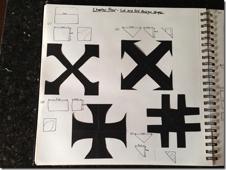
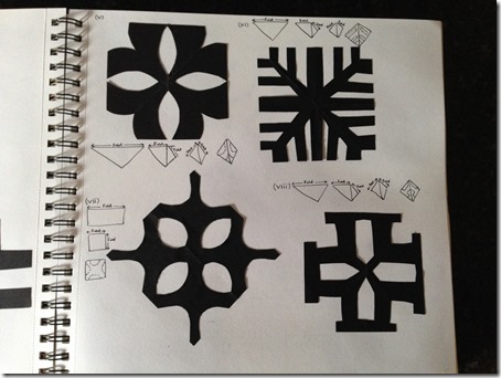
I found this chapter really interesting as it made me really think about how shapes would turn out once I had unfolded the papers. I had a few failed attempts where I cut in the wrong place and ended up with a cross cut in two pieces, as well as some that ended up looking nothing like a cross at all! I tried to create a variety of shapes, some using curves and some with straight lines and angles.

2015-01-02 09.33.30 2015-01-02 09.33.48

Image 4.1 and 4.2 – Symmetrical cut and fold designs in black paper

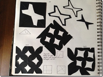
I found it harder to work out how to cut an asymmetrical shape because, by the nature of folding and cutting, one creates a line of symmetry along the fold line (example ix). I realised that an asymmetrical pattern could only be achieved when I folded the paper at odd angles (examples x, xi, xii).

2015-01-02 09.36.35 Image 4.3 – Asymmetrical cut and fold patterns

3-layered patterns

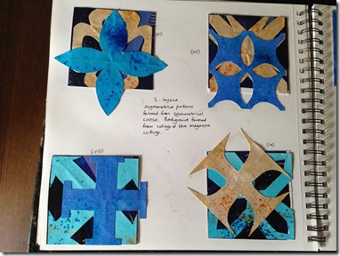
I used my coloured papers for this exercise as well as creating a collaged background sheet from blue paper cut from magazine pages.

2015-01-02 09.36.54 Image 4.4 – 3-layered symmetrical patterns

I was very pleased with pattern (iii) in which I pulled the ‘petals’ of the second layer through the third layer. I can imagine this looking effective when constructed in appliquéd fabrics.

2015-01-02 09.37.04 2015-01-02 09.37.09

Image 4.5 and 4.6 – 3-layered asymmetrical patterns 

I don’t find the patterns created from asymmetrical motifs (examples x to xv) as appealing as the others but imagine that they would create an interesting pattern if repeated e.g. as tiles or patchwork squares.

Time: 5.5 hours

Module 1 – Chapter Three

Due to my difficulties cutting the designs in Chapter Two, I made some more coloured papers using thinner paper for use in this and future chapters.

Design sheet A

I selected the Pattee cross design as the basis for this chapter and was very pleased with the effects created, particularly in (ii) Interchange where the repeated pattern created circles and a new shape gold cross in between the two rows of Pattee crosses.

2014-12-20 21.15.48 2014-12-20 21.15.59

Image 3.1 and 3.2– Sketchbook pages for design sheet A

Time: 2 hours

Design sheet B

 2014-12-20 21.15.39 2014-12-20 21.15.20

Image 3.3 and 3.4 – Sketchbook pages for design sheet B

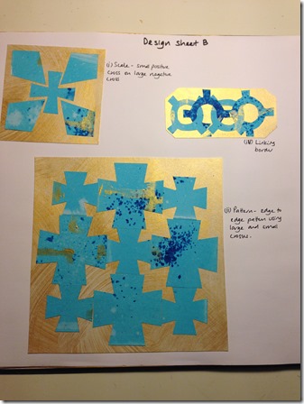
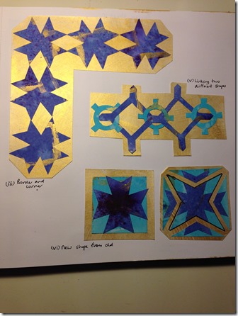
I chose quite simple cross shapes for exercises (i), (ii) and (iii – border and corner).  The edge to edge pattern (ii) illustrated to me the simple way that a pattern can designed and I imagine that if printed on a large scale pattern (ii) would look quite like a dog-tooth check. .

By changing the cross shape into one with an open centre I found that a more intricate range of patterns could be formed by interlacing the shapes.  The interlinked patterns in (iv) and (v) reminded me very much of the geometric patterns used in Islamic art, particularly with the gold background.

In (vi) new shape from old I chose a simple Maltese cross shape for the original cross and another simple shape for the new cross.  The output was a cross that looks more complex simply because of the pattern on it.

Time: 2.5 hours

Design sheet C

I loved this activity, although it was extremely fiddly to cut the intricate shapes.

2015-01-01 20.22.19 Image 3.5 – original cross shape

The cross-shape that I chose, once split into sections as shown in (i) produced some very intricate and interesting shapes. I chose the middle section of my divided and separated cross (ii) and made a cardboard template.

2014-12-20 21.13.17 2014-12-20 21.13.25

Image 3.6 and 3.7 – Sketch book pages for design sheet C

Setting my new motif in various different ways produced some really interesting designs which could be repeated infinitely.   I found that, because the motif had one side which was angular and one which was curved it allowed a great variety of patterns to be developed and, whilst this was a happy accident on this occasion, it will be worth remembering the flexibility that such a shape offers for future design work.  It was also interesting to see that some of the designs formed new cross-shapes (iv) (vi) and (vii).    Again, I felt there were strong similarities to Islamic designs.

Time: 4 hours

Module 1 – Chapter Two

A. Making coloured papers

I chose to use the complimentary colours of blue and yellow/gold for the rest of the module.

I used ultramarine, turquoise, purple and orange Brusho inks and gold acrylic paint to colour my papers. This was my first experience of using Brusho inks and I was very impressed with the effects that can be achieved using them.

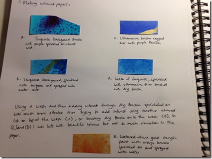
I created four blue papers using the following ‘recipes’:

  • Turquoise wash with purple powder sprinkled on whilst wet
  • Turquoise wash with turquoise powder and sprayed with water mist
  • Ultramarine wash with purple ink ragged over it
  • Turquoise wash with ultramarine powder sprinkled on whilst wet then brushed with a dry brush

2014-11-27 20.12.29

Image 2.1 – Drying the papers

2015-01-01 18.39.50

Image 2.2 – Samples of papers in sketch book

2014-11-30 18.36.24 

Images 2.3 – Ultramarine and turquoise ragged paper – this produced some variation in colour

 2014-11-30 18.45.50

Images 2.4  – Turquoise wash with turquoise powder and sprayed with water mist – this produced a dramatic effect

2014-11-27 20.14.40

Image 2.5 – Turquoise wash with ultramarine powder sprinkled on whilst wet then brushed with a dry brush.  This made a pleasant colour but did not provide a very interesting finish as the ultramarine completely blended with the turquoise. 

2015-01-01 19.06.27-2

Image 2.6 – Turquoise with ultramarine sprinkled whilst wet.  This produced a great variety of colours as the pigments within the ultramarine separated out once wet.

I created a yellow/gold paper using a watered down gold acrylic paint, sprinkled with orange brusho powder and sprayed with a water mist.  This produced a beautiful, rich coloured paper which looked as if the surface had been burnished.

2015-01-01 18.31.26 Image 2.7 – Gold acrylic paint with orange Brusho sprinkled on and sprayed with water

I found that sprinkling dry ink powders onto the wet surfaces gave a very pleasing, and much more dramatic effect, than ragging or brushing colours on top of the wash.

Time: 1.5 hours

Cost: £18 – Brusho inks; £2 – Paper

Health and Safety – make sure the table is very well-covered with newspaper before using Brusho inks. I coloured my papers on a granite kitchen surface with just one layer of newspaper underneath.  Because Granite is not absorbent I thought the ink would wash off easily. This was not the case and I found that, despite giving it a thorough clean after painting, there was still slight ink colouring on my dish-cloth for days later when I wiped down the worktop.

B. Printing on to the coloured papers

I made a rubber stamp in the shape of a quarter of a Jerusalem cross.

 2015-01-01 18.39.56

Image 2.8 – Stamp pattern in sketch book

Using gold acrylic paint I decorated the papers in a number of ways:

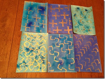
  • A full cross  (top centre image 2.9 below )
  • Half-cross i.e. two quarter crosses set opposite each other  (top left)
  • A chain pattern (bottom centre)
  • Chevron pattern (bottom right)
  • Two random patterns – one with sparse use of the stamp (top right) and one with a lot of overlapping stamps (bottom left)

2014-11-30 19.35.57

Image 2.9 – Printed patterns

Time: 1 hour

C. Cross shapes cut from coloured papers

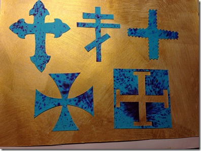
I traced a selection of the cross designs that I used in my line drawings onto my coloured papers and cut them out using a scalpel. 

2014-12-20 21.16.09 2014-12-20 21.16.19

Images 2.10 and 2.11 – Cut crosses from coloured paper

I realised that the paper that I used was much too thick and this made it quite difficult to cut.  As a result, I made  a new set of coloured papers using a thinner paper which will be easier to cut.  I have saved the first batch of papers to use as backgrounds for displaying examples later in the module.

Health and Safety

Use of the scalpel – always use a proper cutting mat and put the cap on the scalpel whenever it is not in use to avoid accidental injury. Make sure the blade is as sharp as possible so that it cuts easily and accurately…a blunt blade is less easy to control and can veer off the cutting line.

Time: 2 hours (due to paper being difficult to cut)

Module 1 – Chapter One

Research on crosses

I chose to use the cross shape for this module as I felt that it would provide a rich supply of reference material due to its extensive use in religious and heraldic images.

I started my research by defining what I mean by a cross. My definition is ‘the junction where two lines overlap at any angle’. The cross could be one which is designed or which occurs incidentally. I then thought of the various ways in which the word ‘cross’ and the cross-shape are used:

  • Description – cross-roads, cross-legged, cross-eyed, cross-purposes, cross-stitch.
  • Verb – to cross a road
  • Emotion – to feel cross about something
  • Identifier – i.e. used by some as a signature
  • Symbol:
    • In algebra
    • As a location on a graph
    • Religious images e.g. crucifix
    • Heraldic image e.g. in flags, shields, medals
    • Logos
    • Swastika

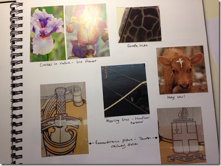
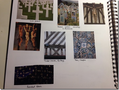
My research on cross images can be grouped into the following themes:

  • Nature e.g. cross-shaped flowers
  • Architectural – this was a particularly rich source of images e.g. leaded and stained windows, brick-work, trellises, paving and tiles.
  • Religious, heraldic and symbolic – numerous different types of cross such as Celtic, papal and astrological.
  • Incidental e.g. crosses formed by crossed mooring ropes in a marina.

2015-01-01 16.36.54   Image 1.1 – Reference images– nature and incidental

2015-01-01 16.37.20Image 1.2 – Reference images – religious and architectural

2015-01-01 16.38.04 Image 1.3 – Reference images – architectural

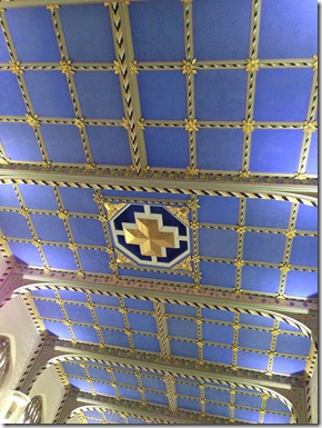
One of my favourite reference images was the ceiling of the Chapel at Wellington School, Somerset.  Not only was this a beautiful example of incidental crosses i.e. where the gold lines crossed as well as a cross motif in the centre, it was also in my chosen colours for the module, gold and blue.

2014-12-09 10.16.47

Image 1.4 – Chapel ceiling, Wellington School

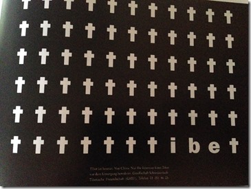
I also found the following use of the cross motif very striking.  It was used in a campaign by the Society for Swiss-Tibetan Friendship to raise awareness of the 1.2 million Tibetans who have died since 1987 as a result of Chinese colonial policies.

2014-12-06 08.51.17

Image 1.5 – Tibet campaign

Additional reference images

IMG_4200[1] IMG_4201[1] 2014-10-28 14.38.20 2014-10-30 16.30.18

From left to right the additional images show an art deco lift door, ornate floor tiles ( in desperate need of a mop!), cobble stones and unusual paving stones.

Rubbings of crosses

 IMG_4427  IMG_4426

Image 1.6 and 1.7 – rubbings of crosses. 1.6 shows a telephone key pad, basket weave and a china ornament.  Image 1.7 shows a cooling rack and the mesh on a speaker.

I used an oil pastel to make the rubbings.  I found that the pastel rubs off onto the opposite pages in my sketchbook and so have covered the pictures with a transparent plastic sheet.

Line drawings

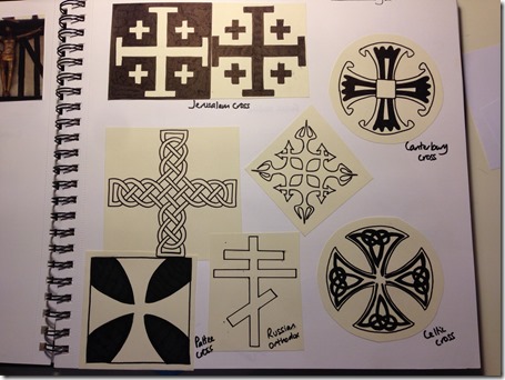
I made line drawings of a selection of the crosses that I found during my research. I particularly liked the Celtic crosses and realised whilst drawing them that the knotted line within the designs is actually one continuous line. I think that the Pattee, Jerusalem and Maltese crosses will work well in the designs in this module as they have strong outlines which will work as both positive and negative images.

2015-01-01 16.37.37 2015-01-01 16.37.52

Images 1.8 and 1.9 – Line drawings of crosses

Colour wheel

I used water colours to create the colour wheel. I found it very enjoyable but much more difficult than I expected to mix certain colours, in particular green, turquoise and violet.

2015-01-01 16.38.20 Image 1.8 – Colour wheel

I also found that adding black to make a shade didn’t just darken a colour, it changed the colour due to the pigments that make up the black paint. This was particularly noticeable on the warm colours such as reds and yellows e.g. the yellow shade became a mustard colour.

2015-01-01 16.38.39 Image 1.9 – Sampling to create correct colours and failed attempts at colour-mixing

Time: 14 hours

Cost: £18 for water colour paints