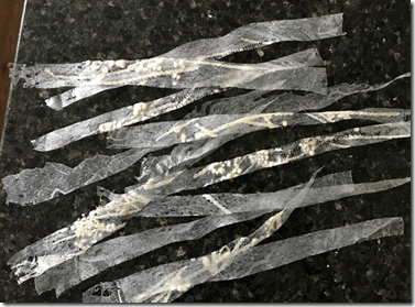
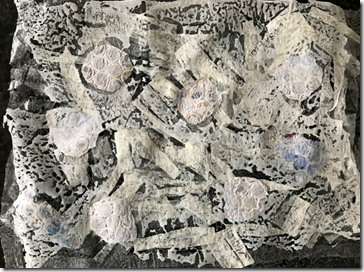
Module 6 – Chapter 3


In this chapter I experimented with free machine embroidery to produce samplers showing different textural effects.  In all of the samples I used a medium weight Calico background and a size 100 needle.  Each patch was about 3cm square.  In samples 3.2 – 3.5 I used the same designs in each position on the grids so that I could see what difference the different techniques and threads made to the effect.  Image 3.1 shows an example of one design dome in four different ways.  The technique using straight whip stitch (top right) produced a much looser interpretation than the others.  This could have been enhanced further with a darker thread in the bobbin.

imageImage 3.1 – comparison of one design in four techniques/threads

image Image 3.2 – Straight stitch – equal tension top and bottom.  These samples produced quite clear shapes; they are drawing with stitch.

image

3.3 Straight whip stitch i.e. tight top tension, loose bottom tension.  This technique produced much looser interpretations of the designs giving a more organic appearance.

image

3.4 Zig-zag whip stitch.  This technique produced a more dense covering of stitch and a pleasing irregularity to the lines in the designs.

image

3.5 Straight and zig-zag cable stitch.  This sampler was all done with the same perle thread hand wound on to the bobbin.  It produced slightly looser versions of the design than the straight stitch samples in 3.2.

image

3.6 – The samples of cable stitch were made using different thicknesses and types of thread.  It was surprising how long this sampler took to make; I had numerous abortive attempts at using different threads in the bobbin.  I tried using different tensions but many of the thicker threads, chenille and tubular threads simply wouldn’t work on my machine.  Those that did work in 3.6 produced some interesting textures that sit on top of the fabric creating a very tactile surface.

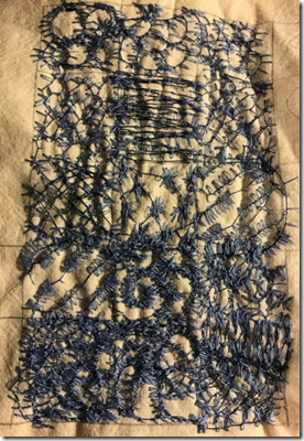
Module 6 – Chapter 1 – extra bits


Below are a few images that I somehow failed to post in my Chapter 1 section.

My interpretations of some of the Masters!

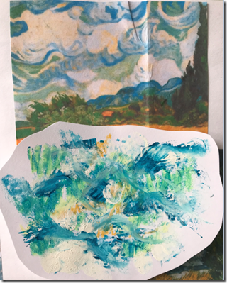
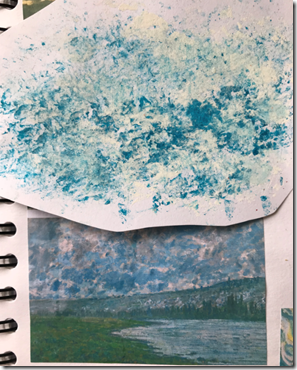
I used various materials to represent some of the colours and shapes in the sky and water in some of the famous paintings I gathered as source material

image

6.1.1 – Original – Van Gogh.  My version – Oil pastel, water and acrylic ink

image

6.1.2 – Original John Piper.  My version – Oil pastel, water and acrylic ink

  image 6.1.3 – Original John Piper.  My version – Oil pastel, water and acrylic ink


image

6.1.4 -Original Monet.  My version – Oil pastel, spray dye and acrylic ink

image

6.1.5 – Original – Van Gogh.  My version – Acrylic paint and oil pastel

image 

6.1.6 – Original – Botticelli.  My version – Acrylic paint and oil pastel

image

6.1.7 – Original – Monet.  My version – Acrylic paint and emulsion paint

image

6.1.8 – Original – internet photo of cloud formation.  My version – water, acrylic ink, oil pastel and emulsion paint

It was great fun creating these interpretations of the colours  and shapes of parts of these famous paintings.  Studying the photos in detail in order to try to create my own versions caused me to analyse the shapes and colours used more than I would otherwise have done.

image

6.1.9 – Various plastic materials used to fuse together – bags, wrapping film, vegetable net, fishing line, nylon tulle, synthetic organza

image

6.1.10 – wrapping film and vegetable net melted together. 

image

6.1.11 – fishing line and bits of sea weed that were stuck to it melted onto plastic bag

image

6.1.12 – and 6.1.13 (below) various plastic materials fused together, cut into pieces and fused again,

image 6.1.13

I think I could get quite addicted to the process of melting and fusing synthetic materials together.  There is something very pleasing about seeing the materials shrink and distort under the layer of baking parchment and then peeling it back to reveal the fused surface.  I was particularly pleased with the way the green vegetable netting melted and became black; adding the appearance of something discoloured and disintegrated as if it has been on the seabed for many years maybe.  The white plastic also melted in an interesting way to produce a holey, lacy texture.

Module 6 – Chapter 2

A bit of art history…

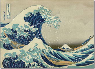
After posting Chapter 1, I read an interesting article about the colour, Prussian Blue.  It was the first synthetically produced paint colour, in the early 1700s, and caused great excitement amongst artists at the time.  What really caught my eye in the article that I read, was that two of the paintings I used as source photos in Chapter 1 were cited.  These were The Great Wave of Kanagawa by Hokusai, and Van Gogh’s Starry Night.  When collecting my source materials I had been drawn to the Prussian blue colours (a longstanding favourite) but also to the elegant wave shapes.  I hadn’t however realised that Van Gogh’s Starry Night is so heavily influenced by Hokusai’s wave, both in colour and shape.  In letters to his brother, Van Gogh professed the Japanese master had left a deep emotional impact on him.

image image


Designing with shapes and layers

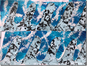
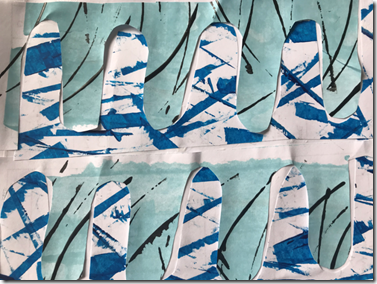
I started by making a collection of papers using the blue and white and colour scheme from my source photos.  Once I had a selection of papers I identified simple shapes from my source photos and then tore pieces of paper to make simple designs based on the shapes.  See images 2.1 – 2.3 below. image

Image 2.1 image Image 2.2.  This one wasn’t every successful as the papers didn’t contrast enough to accentuate the different parts of the design.

imageImage 2.3

Next, I created some more simple designs (see images 2.4 and 2.5) from my decorated papers

image

Image 2.4

image

Image 2.5

I then cut further versions of the same design shape from these samples and combined them to make a further design – see below.imageImage 2.6 

I repeated the process with a different basic design shown in 2.7.

image

Image 2.7

This design was cut again into further versions of the same shape and reassembled as seen in image 2.8

image

Image 2.8

Next I moved on to designs using a paint program on the computer to create digital designs.  In images 2.9 – 2.11 below, I selected basic design shapes and then created multi-layered designs. I digitally cut shapes out and rotated and replaced them to develop the designs.

image

Image 2.9

image

Image 2.10

image

Image 2.11

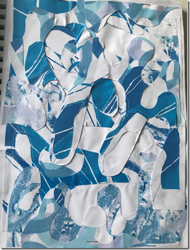
Next I printed out some sheets of the designs I’d created above, and used them as decorative papers for some further handmade designs.  Images 2.12 – 2.13 below show the development of my designs.  I used the digitally produced decorative papers and and repeated the techniques from earlier in the chapter i.e. cutting a basic shape, sticking it on to a backing paper, then cutting and repositioning it several times.  This approach combined both the handmade designs and the digital ones.

image Image 2.12

image

Image 2.13.

Combining these two processes created some really interesting designs that showed interesting depths due to the many layers.  I can imagine that this technique done in fabrics of different tones and textures could be very effective.

Module 6 – Chapter 1

The starting point for this module was to gather some source material relating to water and air.  I started by looking at how sea an sky are represented by various artists.

image

1.1 – Turner and Constable – very dramatic skies – strong brush marks

image

1.2 John Piper – loose, daubed brushwork, moody;  Botticelli – serene

image

1.3 Monet and Van Gogh – strong colours and shapes to build up skies – individual shapes still very visible

image

1.4 Undulatus Esperatus cloud formations – natural formation that looks very unnatural!

image

1.5 Sea;  wave by Hokusai

Images 1.1 – 1.5 above show the start of my research into skies and water in art and from photographs and images found online.  These will no doubt be added to as I work on the module.

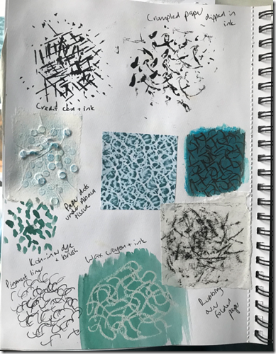
Image 1.6 below shows some marks that I made using a variety of implements to portray some of the shapes within my source material.

image

1.6 Mark making

image

1.7 – layering various marks using different implements

image

1.8 – mark making using sgraffito and frottage over bubble wrap, an oil painting, sequinned fabric and collaged paper circles.

image

1.9 – Mark making – Top row and bottom row – frottage over metal mesh; .  The top left rubbing produced a very pleasing pattern; this was created by moving the paper several times on the metal mesh and taking rubbings.  The images on the middle row were also quite effective.  I used a textured paste and applied it to paper through a stencil; once dry I took some rubbings.

image

1.10 – crayons and inks.  This technique produced well-defined marks.  The way that the ink ‘balled up’ on top of the wax softened the effect.

image

1.11 – overlapped lino print.  I created this effect using a lino block that I created a while ago (see image 1.12) and printing ink.  By overlapping the prints I created a rippled effect.

image

1.12 – lino print

image

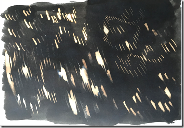
1.13 – Bleach on ink using a range of implements – side of card, cocktail stick, cotton bud, dip pen

In images 1.14 and 1.15 below I chose two of my source photographs and tried a range of mark-making techniques to represent the source material.

image

1.14

image

1.15

The images below show various explorations with transparent materials.

image

1.16 – strips of rubber gripper mat melted between sheets of clear plastic

image

1.17 – wool rovings trapped between sheets of clear plastic.  Looks  a bit like frothy waves

image

1.18 – emulsion paint sandwiched between sheets of clear plastic

image

1.19– sequins trapped between sheets of clear plastic. 

image

1.20 – samples in 1.16 and 1.17 cut into strips and melted between sheets of plastic – see 1.21 below

image

1.21

image

1.22 – white plastic carrier bag cut into swirly strips and melted between clear plastic sheets

image

1.23 – sample in 1.22 with bubble wrap strips added

image1.24 – sections of previous samples cut up again and melted between plastic sheets again

image

1.25- base layer of clear plastic bag, strips of white plastic  and painted bubble wrap melted under a top layer of clear plastic.

image

1.26 – strips of rubber gripper mat melted between clear plastic, then cut into strips, repositioned and sandwiched again. Painted bubble wrap added and melted again.

image

1.27 – strips of gripper mat sandwiched and melted; wool rovings and sequins sandwiched and melted.  Both pieces sliced up, reassembled and sandwiched and melted again in clear plastic.

image 1.28 image 1.29 – white carrier bag melted – I like the way that this is reminiscent of the wave shape in Hokusai’s painting.