Different ways of using the shapes to show disintegration
Images 12.1 and 12.2
Images 12.3 and 12.4
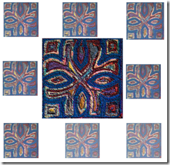
In these samples I used a background card of 8’’ by 8’’ which is the required size for the resolved sample in order to identify designs which could be translated into the final sample. I explored the use of size and colour in giving the appearance of disintegration i.e. the paler, or faded, colour and smaller shapes representing the disintegration. I think that the idea of showing disintegration creeping through the piece is interesting, such as in 12.4 where the shapes are strong in the top left corner and become weaker through the lighter colour to the right bottom corner.
To give me greater flexibility, I decided to try some digital layouts using an image of a previous samples, below.
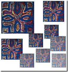 Image 12.5 – Disintegration shown by decreasing size and faded colours moving from left to right
Image 12.6 – Disintegration shown by decreasing size and faded colours moving from centre to edges

Image 12.7 – Disintegration shown by decreasing size and faded colours moving from top left and bottom right i.e. most disintegrated section is central diagonal bottom left to top right.
Image 12.8 – Disintegration shown by decreasing size and faded colours moving in spiral shape.
Composite sheet
I created a composite sheet showing samples throughout the module, as well as some of the original images which inspired my work. The over-riding image which is present is the Maltese Cross. I have enjoyed working with this particular design because of the flexibility of using the positive image of the cross to produce very strong, heraldic designs as well as the softer negative form i.e. the ‘petal’ shapes.
Thoughts on design for resolved sample
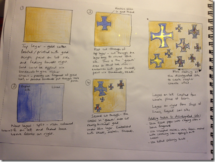
I sketched out some thoughts in my sketchbook as shown below:
The sketchbook page above shows some of my thoughts on the design using some of ideas explored in the exercises above. My main thoughts at this stage were:
– the design needed to work as a square of 8’’ by 8’’ as per the brief for this module. This therefore restricted the design i.e. it could not be linear or rectangular.
– the size limitation meant that if I chose to use a large number of design motifs, they would need to quite small. The stitching techniques to show disintegration would therefore need to be capable of working on small motifs.
– the use of faded colour was effective in illustrating disintegration
– the Maltese Cross offered lots of design possibilities in that it could be used as either a traditional image using the positive shape, or a softer more modern design using the negative ‘petal’ shapes.
Image 12.11 – sketchbook page of techniques to disintegrate
I also wrote down some thoughts on techniques of showing disintegration which I had learnt throughout the module such as:
– stitching past the outline of a shape
– using Brusho ink intensively to represent strength, and more diluted or speckled for areas of disintegration
– using the chenille technique
– adding fragments to the surface of fabric using a bonding agent to look as if it is disintegrating e.g. paper, painted dried leaves, or by machine stitching over tissue paper and leaving fragments trapped in the stitches
– use creased/crumpled surfaces to represent the bubbled texture of rust
– using strong colours which graduate to faded colours through multi-layered reverse appliqué
– using coarse/loose weave fabrics that fray well
– adding tufted knots
– melting areas of a synthetic fabric using a soldering iron
– using ripple effect reverse appliqué to create differences in depth and relief to represent worn out areas e.g. floor tiles which are worn are lower in the middle than at the edges.
With these thoughts in mind I worked on a more detailed design idea:
Image 12.12 – sketched design ideas
I made a number of design decisions:
– I would use the Maltese Cross as my design motif
– I would represent disintegration using three techniques: fading colour from strong to weak; using ripple effect reverse appliqué to produce areas of relief/depth as if worn away; using chenille to create heavily distressed areas
– I would use a gold top layer with blues and other colours underneath.
As I worked more on this design, I realised that the motifs all needed to be an adequate size for the slashing in the reverse appliqué technique i.e. so that a lot of layers became visible. I therefore changed the design to one with four crosses, one in each quadrant of the square – see below. This design also created an additional cross shape in the centre i.e. the space between the four smaller crosses.
 Image 12.13 – first sketches of the final design idea
I decided that I would have an area of strength in one corner, and that the piece would gradually disintegrate along a diagonal line. I chose to disintegrate along the diagonal line as this gave the opportunity to have two of the crosses that were half rich and half disintegrated which I thought would add interest to the sample.
Having decided upon this design layout I made the following decisions:
– The piece should look like an ancient religious/heraldic relic which has started to disintegrate with age. This could be, for example, a fragment of an altar cloth.
– Opulent fabrics and surface decoration such as beading should be used to give the richness required
– The top layer would be gold dupion silk decorated with additional gold in the ‘rich’ area.
– The second layer would be a rich blue dupion silk and the cross in the ‘rich’ area would only be cut through to the second layer i.e. the blue layer.
– The crosses on the ‘disintegration diagonal line’ would have areas which were only slightly disintegrated at the top left, and would be more disintegrated at the bottom right. This would be created by increasing the amount of layers that were slashed through in the more disintegrated area.
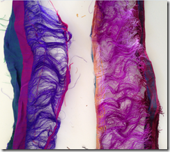
– the layers should include some fragments of heavily frayed sari silk to enable a high level of disintegration to be created (i.e. producing longer threads than by fraying the edges alone).
Creating the top layer
I contemplated a number of ways of decorating the surface of the gold silk with gold acrylic paint to create a richer area in the top left area. These included:
– Painting small marks on to a triangular sheet of Bondaweb the size of half of the square i.e. to cover the whole of the ‘rich’ area and applying this to the silk surface. This would provide a method of adhering the gold marks as well as reducing the amount of fray in the top layer so that the ‘rich’ parts had clean edges when slashed. I tried this approach but did not like the look and feel of the Bondaweb adhesive on the surface of the silk as it reduced the sheen.
– Painting Bondaweb and then cutting bits off and applying them individually to the silk. I tried two ways of creating the bits – one was using a hole punch and one was snipping with scissors. In the image below a brand of bonding material was used which had a diamond shape pattern on it. Image 12.15 shows the bits bonded to the silk. This technique did not produce the opulent effect that I was trying to achieve.
– Adding a layer of gold metallic voile to the silk. I did not like this effect as it hid the surface of the silk too much and became stiff, See image 12.16.
– Printing the paint directly on to the silk. I was very pleased with the effect of his technique. I used the flat round end of a pencil and created a graduating area area of gold spots. I decided to use this technique for the resolved sample. See image 12.17 below.
Image 12.14 – Bonding material painted with gold acrylic paint
 Image 12.15 – bonded bits applied to the silk.
Image 12.16 – layer of gold metallic voile bonded to silk
Image 12.17 – printing directly onto silk
Selecting fabrics for the layers
To create the opulent look that I wanted for my ‘holy relic’ I chose to use silk fabrics. My selection included some pieces of frayed sari silk ribbon and twisted silk threads to add texture. See images 12.18 and 12.19 below. The backing fabric was white cotton to enable the pattern to be drawn on.
Image 12.18 and 12.19
Placing the layers
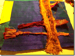
I made 10 layers plus some narrow strips – see images 12.20 and 12.21 below. The partial layers and strips of ribbon and threads were only placed on the area that I wanted to disintegrate. Full pieces were used on the ‘rich’ side in order to keep the layers the same thickness across the whole sample.
Images 12.20 and 12.21
Once all of the layers were in place I pinned them together, including the base layer with the design drawn on.
Stitching the design
Images 12.22 and 12.23
I stitched the design using gold embroidery thread with a narrow zigzag stitch to give the piece strength when slashed.
Cutting the layers
The first layer as cut out on all of the crosses to reveal the rich blue second layer.
 Image 12.24 – blue layer with line drawn on to show split between rich area and disintegrated area.
Because I wanted the top left cross to remain sharp I did two rows of narrow zigzag stitch around the perimeter of the cross to prevent fraying. I also did the same around the two ‘arms’ of each cross which fell in the ‘rich area.
I then cut through to the next layer on three of the crosses. At this point I worked on the two crosses on the diagonal i.e. the partially disintegrated crosses.
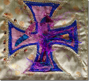
Image 12.25 shows how I created partial disintegration by peeling back sections of the layer and stitching down the peeled back parts using invisible thread. I then worked on the arms of the cross in the disintegrated area and cut into the layers. Image 12.26 below shows the effect of the frayed sari ribbon giving great texture.
Image 12.26 – frayed sari threads
Images 12.27 and 12.28 – completed crosses in the partially disintegrated area. I cut through 7 –8 layers on the two arms in the disintegrated side of these crosses.
Next, I worked on the fully disintegrated cross. Image 12.29 shows the fully disintegrated cross in which I cut through all 10 layers in some places but fewer in others to give variety in colour and changes in the depth of the sections. Again, the long frayed sari threads gave additional interest once revealed.
Image 12.29 – cross in the disintegrated area
Adding more decoration and more disintegration
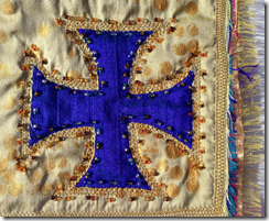
I wanted to maximise the contrast between the two sections of the piece and so added beading to the rich areas. On the rich cross I added a row of coloured glass beads to the edge of the blue cross and another of amber and gold glass beads to the outside edge. I added a few of the amber and gold beads to the partially disintegrated crosses so that it would look as if they had once been fully beaded but fallen off in places over time.

Image 12.30
Next I added some additional lines of stitching to create the chenille sections to add to the disintegration effect – see image 12.31 below.
Image 12.31.
I slashed through all of the layers for the chenille sections and then roughed them up with a wire brush. This created additional contrast to the smooth silk surface of the rich side.
To edge the sample I used a machine embroidery stitch in a honeycomb design. On the disintegrated sections I added fragments as shown in image 12.32
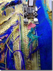 Image 12.32 – stitching fragments into the border
Once the border was stitched I trimmed all of the layers to about 1.5cm and frayed them to create a tufted edge to the piece. Because many of the silks I used were shot, the colours on the warp and weft were different and so this gave additional interest to the tufted edge.
The final resolved sample
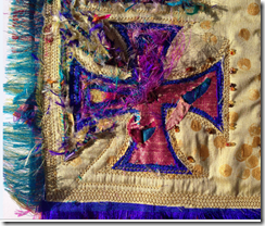
Images 12.33 – 12.35 below show close ups of the crosses in each area i.e. rich, disintegrated and partially disintegrated.
 Image 12.36 – the full resolved sample.
Time: 25 hours
Cost: £17 for silk fabric
![IMG_4681[1] IMG_4681[1]](https://janechippstitch.files.wordpress.com/2015/02/img_46811_thumb.jpg?w=184&h=244)
![IMG_4682[1] IMG_4682[1]](https://janechippstitch.files.wordpress.com/2015/02/img_46821_thumb.jpg?w=184&h=244)
![IMG_4683[1] IMG_4683[1]](https://janechippstitch.files.wordpress.com/2015/02/img_46831_thumb.jpg?w=184&h=244)
![IMG_4684[1] IMG_4684[1]](https://janechippstitch.files.wordpress.com/2015/02/img_46841_thumb.jpg?w=244&h=184)










![IMG_4631[1] IMG_4631[1]](https://janechippstitch.files.wordpress.com/2015/02/img_46311_thumb.jpg?w=421&h=221)
![IMG_4626[1] IMG_4626[1]](https://janechippstitch.files.wordpress.com/2015/02/img_46261_thumb.jpg?w=407&h=306)
![IMG_4632[1] IMG_4632[1]](https://janechippstitch.files.wordpress.com/2015/02/img_46321_thumb.jpg?w=426&h=224)
![IMG_4633[1] IMG_4633[1]](https://janechippstitch.files.wordpress.com/2015/02/img_46331_thumb.jpg?w=410&h=308)
![IMG_4634[1] IMG_4634[1]](https://janechippstitch.files.wordpress.com/2015/02/img_46341_thumb.jpg?w=252&h=190)
![IMG_4660[1] IMG_4660[1]](https://janechippstitch.files.wordpress.com/2015/02/img_46601_thumb.jpg?w=224&h=297)
![IMG_4642[1] IMG_4642[1]](https://janechippstitch.files.wordpress.com/2015/02/img_46421_thumb.jpg?w=117&h=155)
![IMG_4643[1] IMG_4643[1]](https://janechippstitch.files.wordpress.com/2015/02/img_46431_thumb.jpg?w=116&h=153)
![IMG_4644[1] IMG_4644[1]](https://janechippstitch.files.wordpress.com/2015/02/img_46441_thumb.jpg?w=111&h=147)
![IMG_4646[1] IMG_4646[1]](https://janechippstitch.files.wordpress.com/2015/02/img_46461_thumb.jpg?w=120&h=159)
![IMG_4647[1] IMG_4647[1]](https://janechippstitch.files.wordpress.com/2015/02/img_46471_thumb.jpg?w=116&h=153)
![IMG_4648[1] IMG_4648[1]](https://janechippstitch.files.wordpress.com/2015/02/img_46481_thumb.jpg?w=120&h=159)
![IMG_4650[1] IMG_4650[1]](https://janechippstitch.files.wordpress.com/2015/02/img_46501_thumb.jpg?w=134&h=177)
![IMG_4653[1] IMG_4653[1]](https://janechippstitch.files.wordpress.com/2015/02/img_46531_thumb.jpg?w=130&h=172)
![IMG_4673[1] IMG_4673[1]](https://janechippstitch.files.wordpress.com/2015/02/img_46731_thumb.jpg?w=144&h=191)
![IMG_4676[1] IMG_4676[1]](https://janechippstitch.files.wordpress.com/2015/02/img_46761_thumb.jpg?w=146&h=193)
![IMG_4675[1] IMG_4675[1]](https://janechippstitch.files.wordpress.com/2015/02/img_46751_thumb.jpg?w=144&h=191)
![IMG_4678[1] IMG_4678[1]](https://janechippstitch.files.wordpress.com/2015/02/img_46781_thumb.jpg?w=138&h=183)
![IMG_4679[1] IMG_4679[1]](https://janechippstitch.files.wordpress.com/2015/02/img_46791_thumb.jpg?w=136&h=180)
![IMG_4661[1] IMG_4661[1]](https://janechippstitch.files.wordpress.com/2015/02/img_46611_thumb.jpg?w=130&h=172)
![IMG_4662[1] IMG_4662[1]](https://janechippstitch.files.wordpress.com/2015/02/img_46621_thumb.jpg?w=131&h=173)
![IMG_4663[1] IMG_4663[1]](https://janechippstitch.files.wordpress.com/2015/02/img_46631_thumb.jpg?w=127&h=168)
![IMG_4665[1] IMG_4665[1]](https://janechippstitch.files.wordpress.com/2015/02/img_46651_thumb.jpg?w=131&h=173)
![IMG_4664[1] IMG_4664[1]](https://janechippstitch.files.wordpress.com/2015/02/img_46641_thumb.jpg?w=188&h=142)
![IMG_4666[1] IMG_4666[1]](https://janechippstitch.files.wordpress.com/2015/02/img_46661_thumb.jpg?w=133&h=176)
![IMG_4667[1] IMG_4667[1]](https://janechippstitch.files.wordpress.com/2015/02/img_46671_thumb.jpg?w=143&h=189)
![IMG_4669[1] IMG_4669[1]](https://janechippstitch.files.wordpress.com/2015/02/img_46691_thumb.jpg?w=183&h=138)
![IMG_4668[1] IMG_4668[1]](https://janechippstitch.files.wordpress.com/2015/02/img_46681_thumb.jpg?w=143&h=189)
![IMG_4670[1] IMG_4670[1]](https://janechippstitch.files.wordpress.com/2015/02/img_46701_thumb.jpg?w=143&h=189)
![IMG_4671[1] IMG_4671[1]](https://janechippstitch.files.wordpress.com/2015/02/img_46711_thumb.jpg?w=142&h=188)
![IMG_4672[1] IMG_4672[1]](https://janechippstitch.files.wordpress.com/2015/02/img_46721_thumb.jpg?w=139&h=184)


![IMG_4613[1] IMG_4613[1]](https://janechippstitch.files.wordpress.com/2015/02/img_46131_thumb.jpg?w=184&h=244)
![IMG_4614[1] IMG_4614[1]](https://janechippstitch.files.wordpress.com/2015/02/img_46141_thumb.jpg?w=242&h=321)
![IMG_4615[1] IMG_4615[1]](https://janechippstitch.files.wordpress.com/2015/02/img_46151_thumb.jpg?w=240&h=318)
![IMG_4617[1] IMG_4617[1]](https://janechippstitch.files.wordpress.com/2015/02/img_46171_thumb.jpg?w=328&h=436)
![IMG_4589[1] IMG_4589[1]](https://janechippstitch.files.wordpress.com/2015/02/img_45891_thumb.jpg?w=233&h=309)
![IMG_4590[1] IMG_4590[1]](https://janechippstitch.files.wordpress.com/2015/02/img_45901_thumb.jpg?w=239&h=317)
![IMG_4622[1] IMG_4622[1]](https://janechippstitch.files.wordpress.com/2015/02/img_46221_thumb.jpg?w=241&h=320)
![IMG_4619[1] IMG_4619[1]](https://janechippstitch.files.wordpress.com/2015/02/img_46191_thumb.jpg?w=242&h=321)
![IMG_4635[1] IMG_4635[1]](https://janechippstitch.files.wordpress.com/2015/02/img_46351_thumb.jpg?w=228&h=302)
![IMG_4601[1] IMG_4601[1]](https://janechippstitch.files.wordpress.com/2015/02/img_46011_thumb.jpg?w=238&h=316)
![IMG_4620[1] IMG_4620[1]](https://janechippstitch.files.wordpress.com/2015/02/img_46201_thumb.jpg?w=362&h=481)
![IMG_4558[1] IMG_4558[1]](https://janechippstitch.files.wordpress.com/2015/02/img_45581_thumb.jpg?w=338&h=254)
![IMG_4536[1] IMG_4536[1]](https://janechippstitch.files.wordpress.com/2015/02/img_45361_thumb.jpg?w=438&h=230)
![IMG_4528[1] IMG_4528[1]](https://janechippstitch.files.wordpress.com/2015/02/img_45281_thumb.jpg?w=166&h=217)
![IMG_4529[1] IMG_4529[1]](https://janechippstitch.files.wordpress.com/2015/02/img_45291_thumb.jpg?w=184&h=244)
![IMG_4533[1] IMG_4533[1]](https://janechippstitch.files.wordpress.com/2015/02/img_45331_thumb.jpg?w=184&h=244)
![IMG_4535[1] IMG_4535[1]](https://janechippstitch.files.wordpress.com/2015/02/img_45351_thumb.jpg?w=184&h=244)
![IMG_4531[1] IMG_4531[1]](https://janechippstitch.files.wordpress.com/2015/02/img_45311_thumb.jpg?w=186&h=243)
![IMG_4530[1] IMG_4530[1]](https://janechippstitch.files.wordpress.com/2015/02/img_45301_thumb.jpg?w=184&h=244)
![IMG_4537[1] IMG_4537[1]](https://janechippstitch.files.wordpress.com/2015/02/img_45371_thumb.jpg?w=184&h=244)
![IMG_4538[1] IMG_4538[1]](https://janechippstitch.files.wordpress.com/2015/02/img_45381_thumb.jpg?w=313&h=236)
![IMG_4540[1] IMG_4540[1]](https://janechippstitch.files.wordpress.com/2015/02/img_45401_thumb.jpg?w=185&h=241)
![IMG_4541[1] IMG_4541[1]](https://janechippstitch.files.wordpress.com/2015/02/img_45411_thumb.jpg?w=184&h=240)
![IMG_4543[1] IMG_4543[1]](https://janechippstitch.files.wordpress.com/2015/02/img_45431_thumb.jpg?w=186&h=243)
![IMG_4548[1] IMG_4548[1]](https://janechippstitch.files.wordpress.com/2015/02/img_45481_thumb.jpg?w=244&h=184)
![IMG_4559[1] IMG_4559[1]](https://janechippstitch.files.wordpress.com/2015/02/img_45591_thumb.jpg?w=169&h=221)
![IMG_4560[1] IMG_4560[1]](https://janechippstitch.files.wordpress.com/2015/02/img_45601_thumb.jpg?w=184&h=244)
![IMG_4564[1] IMG_4564[1]](https://janechippstitch.files.wordpress.com/2015/02/img_45641_thumb.jpg?w=184&h=244)
![IMG_4566[1] IMG_4566[1]](https://janechippstitch.files.wordpress.com/2015/02/img_45661_thumb.jpg?w=184&h=244)
![IMG_4567[1] IMG_4567[1]](https://janechippstitch.files.wordpress.com/2015/02/img_45671_thumb.jpg?w=184&h=244)
![IMG_4572[1] IMG_4572[1]](https://janechippstitch.files.wordpress.com/2015/02/img_45721_thumb.jpg?w=184&h=244)
![IMG_4573[1] IMG_4573[1]](https://janechippstitch.files.wordpress.com/2015/02/img_45731_thumb.jpg?w=184&h=244)
![IMG_4582[1] IMG_4582[1]](https://janechippstitch.files.wordpress.com/2015/02/img_45821_thumb.jpg?w=185&h=244)
![IMG_4584[1] IMG_4584[1]](https://janechippstitch.files.wordpress.com/2015/02/img_45841_thumb.jpg?w=244&h=184)
![IMG_4556[1] IMG_4556[1]](https://janechippstitch.files.wordpress.com/2015/02/img_45561_thumb.jpg?w=244&h=184)
![IMG_4557[1] IMG_4557[1]](https://janechippstitch.files.wordpress.com/2015/02/img_45571_thumb.jpg?w=244&h=184)
![IMG_4583[1] IMG_4583[1]](https://janechippstitch.files.wordpress.com/2015/02/img_45831_thumb.jpg?w=244&h=184)
![IMG_4585[1]](https://janechippstitch.files.wordpress.com/2015/02/img_45851-e1422872860521.jpg?w=300&h=225)
![IMG_4563[1]](https://janechippstitch.files.wordpress.com/2015/02/img_45631.jpg?w=300&h=225)