Presentation board

The final part of this module was to create a presentation board which illustrates the design process that I followed for the wall hanging.

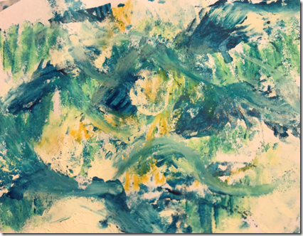
I decided to make a folding board so that the display would be protected whilst stored.  I cut two pieces of foam board (30cm x 45cm each) and made a hinge in the middle using a strong adhesive tape.  I then painted, printed and stencilled the front of the boards with various acrylic paints to create an ocean-like appearance in keeping with my theme.

image Image 1 – Close up of the decorated background

image

Image 2 – the boards before shaping and adding samples

I wanted to continue the design theme of circles that I used in the wall hanging and so used a compass to make arcs in different sizes around the edge of the boards and cut around them.  I also used different coloured paper circles to display the samples and provide information (see image 3 below)

image

Image 3 – the completed board

Images 4 and 5 below show close ups of each side of the board

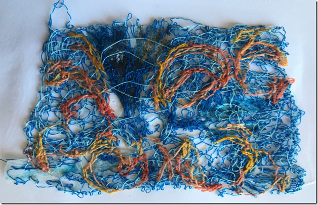
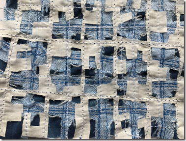
image Image 4 – shows the exploration of different types of plastics, the design plan of the wall hanging and the materials and ideas for the different layers.

image Image 5

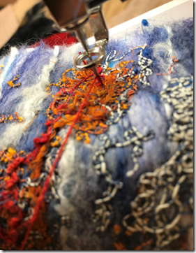
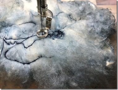
Image 5 shows the experiments that I conducted in combining stitch with the various types of plastic along with the final samples for each layer

image

THE END!

Storage of materials and samples

Item

Storage place

Ideal conditions

Design work in progress

Flat pieces attached in sketchbook, 3D pieces kept in plastic containers

Away from sun, dust, children, pets, liquids

Completed embroidery

Attached in sketchbook

Wrap in acid free paper

Completed design work

Stored in plastic container with lid

Wrap in acid free paper

Papers for design work

In sketchbook


Inks and paints

Stored in plastic container with lid

Upright, lids secure, cool dark conditions

Glue, bleach, sprays

Stored in plastic container with lid

Upright, lids secure, cool dark conditions and away from children and pets

Embroidery work in progress

Stored in plastic container with lid next to my desk

Accessible to continuous work, away from usual hazards

Fabrics

Stored in plastic containers with lid. Sorted by colour and type of fabric.

Dry, away from sun. Flat or rolled in colour or fibre order. Acid free tissue paper

Threads

Frequently used threads are on a wall mounted bobbin holder, others are in plastic lidded containers by colour.

Dry, away from sun, untangled and in colour/type order

Beads, metal threads etc

Stored in plastic container with lid. Beads in small plastic pots.

In acid free tissue, not plastic bags.

Dyes, paints etc

Stored in plastic container with lid

Lids secure, cool temperature, lidded container.

Sewing machine

On desk in working position with cover over it when not in use. I have separate desks for sewing and messy work

Normal room temp and humidity. Kept upright. In working position ready for use.

Other electrical equipment

Stored in plastic container with lid

Dry place with flex tightly wound.

Health and Safety considerations

Item

Safety precaution

Machine stitching

Use chair with back support and easy access to pedal.

Keep flexes out of the way of tripping or damaging wires.

Keep fingers away especially when free-stitching!

Mono printing

Protect surfaces with newspaper to stop inks and paints transferring where not wanted

Cutting with blade / rotary cutter

Use self-healing mat

Put cover on blade when not in use

Cut away from yourself

Cutting plastics e.g. milk bottles

Take care with craft knife and retract blade when not in use

Use of hot air gun to melt synthetic fabrics

Place on a heatproof surface

Keep fingers and flammable materials away

Cool in a safe place

Gluing

Protect surfaces.

Do not touch wet glue when using hot glue gun

Ironing

Switch off when not in use

Ensure flex is not trailing to cause trip hazard

Dying

Protect hands, clothes and surfaces from dye

Melting/fusing plastics

Ensure adequate ventilation because of fumes

Protect the iron and board with greaseproof paper

Time and costs

Module 6

Chapter

Time (hours)

Cost

1

10.5

0

2

3.5

0

3

13

Threads that I already had – approx. £5 worth

4

3.5

£13 procion dye

£12 white threads to dye

5

6.5

Threads that I already had – approx. £5 worth

6

6

Fabrics and threads that I already had – about £10 worth

7

7

Soluble fabrics – £22

8 – 11

46

Machine embroidery threads £34

Fishing line £3.50

Dowel – £2

12

1

0

Total

97

£106.50

Chapter 12 – Study of three artists

Jae Maries

Jae Maries is a painter and textile artist and is a member of the 62 Group.   Jae creates abstracted interpretations of the world surrounding her, and of her personal reactions to everyday situations.  Her work is often informed by her daily sketchbooks.

Her medium is fabrics which are painted with oil paints or dyed, minimal hand stitches and sometimes with screen printing inks  applied after the fabric has been manipulated and stitched.

image Deep Freeze

image Turbulent Seas

Relevance to this module:  Jae’s work tells stories, in the same way that my Module 6 piece does.  In the piece above, Turbulent Seas, Jae tells a story about the recent history of an English fishing port. The stormy seas suggest the energy and danger of the fishing industry at its peak in the 1950s and then the port’s decline through the successive years.  Jae uses a limited pallette and abstracted designs.


Barbara Lee Smith

image Marshland Spring

image

Barbara Lee Smith is an American textile artist.  Her current work is inspired by the land and sea and sky and her travels. She creates both representational and abstract works closely on the environment and creates some very small pieces (6 x 6″) as well as large scale works  up to 15′.

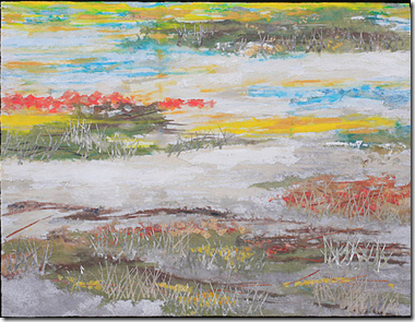
She uses a textile base for painting, collage and drawing with a machine.   The textile base is collaged with fused left-over bits and large pieces of previous paintings on the same material (Lutrador), and then machine stitched.

Relevance to this module:  Barbara’s work is relevant to the environmental theme of this module.  She believes that creation arises from destruction such as the tide hauling detritus out to sea, transforming it and sending it back to the land, illness and accidents healed; people finding strength to battle tyrants.  This makes me think of the many amazing ways in which nature adapts to deal with threats; although sadly, it is unlikely that it can adapt to overcome the threats posed by large-scale plastic pollution.

Chris Jordan

Chris Jordan is an American  photographic artist who creates powerful images of mass consumption.  His works give the message that, in  isolation, individual purchases of electronics, single-serving foods, and plastic amenities do not trigger visions of an environmental emergency. But as the human population approaches eight billion, the amplification of every small act of consumption translates into the rapid and degradation of the natural world.

In a body of work entitled “Intolerable Beauty: Portraits of American Mass Consumption,” Jordan visited landfills and recycling centres to photograph vast piles of discarded products such as mobile phones, chargers, circuit boards, crushed cars, glass bottles and other consumer goods.  He transformed these billowing piles into abstract art whose beauty is at odds with the reality that discarded items consume resources in the recycling process and propel a stream of waste into landfills, wastewater plants and the atmosphere.

image Cell phones

 image

This interpretation of Van Gogh’s Starry Night depicts 50,000 cigarette lighters, equal to the estimated number of pieces of floating plastic in every square mile in the world’s oceans.  It is assembled from thousands of smaller photographs.

Relevance to this module:  Chris Jordan creates astonishing pieces of artwork that inform the audience about the impact of our individual actions and purchases on the environment, including plastic pollution in the oceans.

Construction of the wall-hanging

According to the assessment criteria, the wall-hanging has to be between A2 (40cm x 60cm) and A1 size (60cm x 80cm).  It doesn’t have to be rectangular but should have the same area as A2 or A1.  I decided to make a circular wall hanging so that I could continue the theme of circles.

Using my vague memories of Pythagoras I worked out that for a circle to have roughly the same area as an A2 size hanging I would need a circle with a diameter of 56cm.  I sketched out a design (Image 12.1 below).

image Image 12.1

My structure would have seven columns of circles as shown.  By making the diameter of each circle approximately 8cm the whole hanging would have a diameter of approximately 56cm. 

To recap from the previous chapter, “The top of the wall hanging represents the surface of the ocean in one of the gyres; a surface entirely covered in plastic.  The bottom of the hanging represents the beautiful sea life which is free of plastic.  From the bottom upwards, the nature samples become more and more enmeshed with plastic until the top layer which is wholly plastic.

The wall hanging comprises five different elements:

  • Plastic circles

  • Plastic circles combined with plastic lace

  • Plastic circles combined with embroidered plastic lace

  • Embroidered plastic lace

  • Embroidered circles

My first step was to create enough of each of the five elements for the final construction.

Top layer – all plastic:  I wanted these pieces to be quite solid, unyielding and not particularly attractive.  I used the milk bottle plastic described previously and stitched more circles to it, using bonded plastic and milk bottle plastic, to represent the numerous pieces of plastic floating on the surface of the ocean.

image

Image 12.2

Layer 2 – Plastic and plastic lace:  For this layer I combined milk bottle plastic with plastic ‘lace’. I cut out circles to let the lace show through in places (image 12.3).

 image

Image 12.3

Layer 3 – Plastic circles combined with embroidered plastic lace:  on this layer I let the lace be the main component and added some plastic circles to them (image 12.4).  This is the layer where the nature elements start to appear i.e. where they haven’t been completely swamped by the plastic.

image

Image 12.4

Layer 4 – plastic lace and stitch: I made several pieces of lace with stitch added.  I varied the amount of stitch so that those nearest to the top were more plastic than stitch, and those closer to the bottom were more stitch.  By keeping some of the Aquabond residue in the pieces I was able to keep the stitched circles quite firm.  I wanted them to retain their circular ‘molecular’ shapes well to represent the elements of nature, fighting for survival amidst the plastic.

image Image 12.5

image

Image 12.6

image

Image 12.7

image Image 12.8

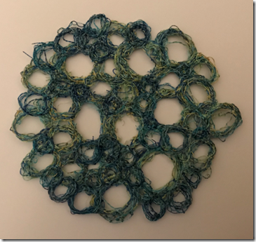
Layer 5 – all stitch: I had already made most of these pieces in the previous chapter.  This was one of the few occasions where I opted to use variegated thread.  Different shades within the variegated thread gave a softer, more natural effects than a solid colour would have given.  The separate pieces also blended well together because they shared some common colours within the variegation, creating a more cohesive appearance than would have been achieved with separate single colours. 

image Image 12.9

image

Image 12.10

I arranged the pieces several times to find the right positions and settled on the arrangement shown in image 12.11 below.

image

Image 12.11

To connect the pieces I used some clear nylon fishing line and stitched each of the pieces in the seven columns ensuring that there was enough thread between the pieces to allow them to move freely when suspended. 

I considered different materials for the rod which would support the hanging:

  • I went to a local fishing supplies store to see if they had any broken fishing rods that I could use as I wanted to explore the idea of using some waste materials in keeping with the theme of man-made waste in the oceans.  The shop owner was happy to give me a broken fibre glass rod, and I tried using this but it didn’t work well as the rod was too tapered. 
  • I then considered using a piece of doweling and painting it or wrapping it in plastic to make it blend in with the hanging.  The painted doweling looked too solid and detracted from the quite ethereal nature of the hanging. 
  • Wrapping the doweling in plastic and threads worked quite well as it blended the rod with the hanging pieces.
  • Another option that I considered was to buy an acrylic rod which was available for £3 online.  However, I decided against this as it seemed wrong to be buying new plastic for a project aimed at highlighting the need to reduce our usage of plastics. 

I therefore opted for the doweling wrapped in plastics and thread (see image 12.12).

image

Image 12.12


The final wall hanging

The images below show the final wall-hanging.  As can be seen, the hanging comprises seven hanging columns which can move freely.  I contemplated joining the columns together as that would have ensured that the circles all faced forward and so their surfaces could all be seen.  However, once I attached them to the rod, I really liked the way that they could twist and turn; it produced a much more exciting piece with the circles being at various different angles.

image

Image 12.13

image Image 12.14

image

Image 12.15

image

Image 12.16


Evaluation

How do I feel about this final piece?

I am very pleased with this final piece; more pleased than I expected to be at various stages of the module when I was struggling to work out how to depict my thoughts.  It is the piece that has taken the most thought and planning out of all of the modules.  There were several design themes that I was keen to include:

  • That the piece would represent sea life in its many forms being smothered by plastic.  I didn’t want anything to obvious or twee e.g. using fish shapes.  I think that by using these molecular-looking structures I have achieved this; they represent the natural elements and compounds that make up the vast array of sea life forms. 
  • That there should be strong contrasts between the materials used i.e. man-made versus natural.  I feel that this was achieved by using the firm plastic for the top layers and natural silk and cotton threads for the sea-life layers.
  • That the piece should tell a story i.e. the gradual domination of the ocean by plastics.  I think that this is achieved by the changing structure of the pieces from all plastic at the top, through various hybrid pieces, to the natural pieces at the bottom.
  • That the piece should move in a way that echoes the ocean.  By stringing the pieces using fishing line and suspending them as individual columns, I have achieved this.  The columns are free to move in a breeze and twist around.

Is it fit for purpose?

At its most basic, yes, as a wall hanging it does what it needs to do; it is the size as requested in the brief and it is able to be hung on a wall.  In terms of whether it meets the brief of representing an environmental theme, then I believe it does this too.  I have tested it out on various friends and family and they were all able to describe to me what they thought the piece was telling them i.e. that the plastic was smothering and corrupting the natural life forms.

What would I change if I designed and made it again?

I don’t think I would change anything at all on it.  I have tried numerous iterations, and spent a long time thinking of how I wanted the piece to look and how to construct it, and have arrived at a final piece that I am totally happy with; anything that I thought didn’t work was changed along the way.

Module 6 – Chapters 8 – 11

Research for Conservation Theme

As a keen sailor and beach-walker, I was keen to use water, and in particular the world’s oceans as the basis for my final piece.  I did some research into the main environmental threats  to oceans as a starting point (image 8.1).

image Image 8.1

Whilst there were numerous topics that I could have chosen, there had been two extremely sad photographs in the national media during the week, both relating to the tragic impact of plastics on ecosystems and wildlife.  I therefore chose to focus on plastics in the ocean. 

image 8.2 – Stork trapped in plastic bag (fortunately the photographer was able to rescue it and remove the bag).

image

image

Image 8.3 – Whale that died due to being so full of plastic bags that it could no longer digest real food.

Other tragic images that made me want to chose this topic included this Albatross (image 8.4) which was full of plastic objects that it had eaten.

image

Image 8.4 – Albatross full of undigested plastics

image image

Image 8.5 – Sea otter rescuing its pup from a plastic bag

image Image 8.6 – sketchbook pages

I learned that, due to the way the world’s currents work, there are five massive ‘gyres’ in the world which are floating garbage patches.  The largest, in the Pacific, is three times the size of France. 
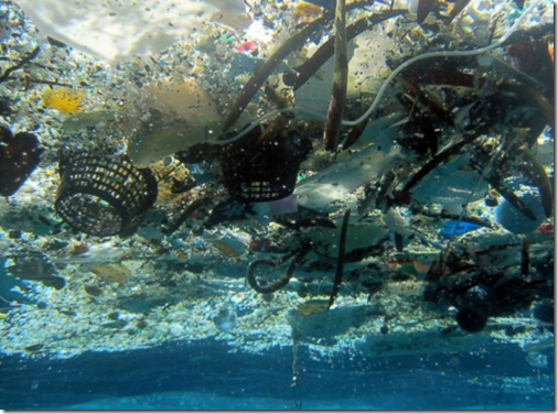
image Image 8.7 – the Great Pacific Garbage Patch

Below, a poignant version of Hokusai’s great wave, this time full of plastic (image 8.8).
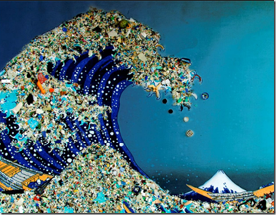
image

Image 8.8

Some of the facts that really hit home for me were:

  • By 2050 there will be more plastic in the ocean than fish
  • Every piece of plastic ever made STILL EXISTS
  • An estimated 90% of sea birds have eaten plastic
  • Americans throw away 2.5 million plastic bottles EVERY HOUR

Knowing that every piece of plastic ever made still exists made me more aware than usual of the amount of plastic in our lives.  Despite the fact that I thought I was a discerning shopper, almost every item that I used for making breakfast and lunch on the day I wrote this was in single-use plastic packaging.  I have started collecting items which may be used in my final piece.

Whilst this research saddened and frightened me enormously, it also made me want to express these feelings through my wall hanging.  I became excited by the possibilities of how I could represent some of these issues.

My starting point on developing design ideas was to create a list of words that related to my theme of plastic pollution in the ocean.

imageImage 8.9

As the list of words shows, my thoughts were about the plastics smothering and overpowering the oceans and sea-life within them.

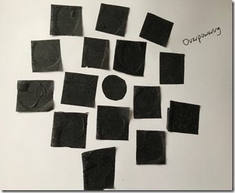
I then used papers to create shapes and compositions that represented some of these words as follows:

 imageImage 8.10 – Enveloped

  imageimage

Images 8.11 and 8.12 – Dominated

image image

Images 8.13 and 8.14 – Trapped

image image

Images 8.15 and 8.16 – Overpowered

imageImage 8.17 – Choked

image image

Images 8.18 and 8.19 – Smothered

image image

Images 8.20 and 8.21 – Stifled

The course notes suggested further exercises using papers to help with the design process.  After discussion with Sian, we agreed that these would be of limited help as I had already developed some design ideas which I had discussed with Sian at Summer School, and so I worked on the following ideas.

Contrasts:  I thought about a number of contrasts to represent the plastics and the delicate organisms. 

Man-made / organic

Hard edges of plastics / soft edges of plants and animals

Bright vibrant colours of organisms  / white or obscured surfaces of plastics

Shapes:  I wanted to use repeated shapes in my design that could represent both the plastic and natural organisms.  I decided on circles for a number of reasons:

  • Representing the natural world – like a globe
  • Ripples from water drops make circles
  • Cross section of plastic bottles are circular
  • Circles trap / enclose things inside them
  • Plastics are made from numerous chemicals – circles connected together will look like atoms in an atomic structure.  Similarly, they could be atoms of H2O i.e. water.

image

Image 8.22 – sketchbook page

Materials:  for the sea-life organisms I decided to use soluble fabrics and machine embroidery threads to create delicate, brightly coloured pieces.  The sea-life pieces would be representational i.e they would represent all living organisms in the sea rather than looking specifically like fish, coral, seaweed etc.  I decided to use a range of plastics to explore the best way to represent the smothering plastic pollution.

Structure

I decided that I wanted the wall hanging to be made up of numerous elements loosely connected together so that they  could move and undulate like the ocean. 

The smaller elements should each represent either plastic, natural organisms, or both i.e. the natural organisms being smothered by the plastic.

One of my early ideas was to use sections cut from plastic bottles to create rings which would have embroidered pieces trapped within them.  I experimented with ways of making these plastic rings.  Having cut several rings from plastic bottles I tried different methods of melting them.  I wanted them to stay circular, but to loose the look that they had just been cut from a bottle.  The most successful method was to put a metal pastry cutter inside a plastic ring and then melt it around the cutter using a hot air gun.

image Image 8.23

Having created plastic rings in this way, I explored ways of attaching embroidered pieces.  I made a few stitched samples using soluble fleece and tried to suspend them within the rings using nylon thread. 

image image

Image 8.24 and 8.25

My idea was to connect these rings using nylon thread into a net type structure.  However, I decided that this approach didn’t really depict the sense of obscuration or smothering enough.  I therefore decided to explore different ideas.

image

Image 8.26 – sketchbook page

I thought about creating plastic ‘pods’ which could contain some of the ‘organisms’.

image

Image 8.27 – plastic pod

This had possibilities, but looked too clumsy.

I thought about using plastic milk bottle plastic as it is semi-transparent and so is able to partially obscure things behind it.

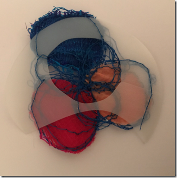
image image

Images 8.28 and 8.29

I liked the idea of partially obscuring the stitched pieces and explored that further.

I wanted to investigate methods of combining plastic with stitch so that there could be some kind of graduation in the wall hanging i.e. delicate stitched pieces representing the un-smothered organisms; pieces that combined plastic and stitch i.e. starting to be overpowered and then just plastic pieces where the plastic had dominated the ocean.  I decided to use some plastic ‘lace’ and stitch on top of it.

image image

Image 8.30 and 8.31

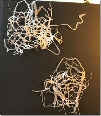
I cut some plastic carrier bags into thin strips and then melted them between greaseproof paper using an iron.

image

Image 8.32

I tried different types of polythene to find the best material.  The white plastic melted better than this see through polythene.
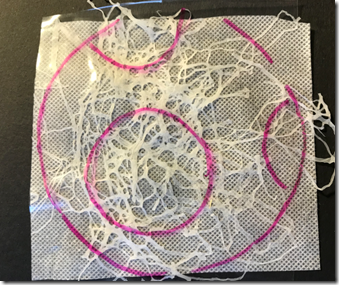
image image

Image 8.33 and 8.34

I sandwiched these pieces of plastic lace between Aquabond and some transparent soluble film and machine embroidered through it to create combined plastic/stitch samples.

image

Image 8.35

I was quite pleased with the way that these turned out: they had a slightly mutated appearance…like nature gone wrong in some way as if it had been corrupted by the plastic.

I then explored ways of combining these pieces with other plastics.

image Image 8.36 – sketchbook page

I tried cutting circles from the milk bottle plastic

 imageimage

Images8.37 and 8.38

The milk bottle plastic was easy to stitch through and so I was able to merge the stitched piece with it.  When suspended it became slightly transparent and showed the embroidered piece in places which gave the impression that I wanted i.e the natural organism fighting for space through the plastic.

I then tried bonding circles of carrier bag plastic together to see how it could be used.

image

Image 8.39

I tried cutting circles from it and placing the embroidered pieces behind as if they had been trapped.

image image

Images 8.40 and 8.41

This gave the impression of obscuring the embroidered pieces quite well, but became too solid i.e. it didn’t flow or undulate.

I then used the circles that I had cut from the bonded plastic bags and threaded them on to a batten.  I did the same with the embroidered pieces and put them behind the plastic pieces.

image image

Image 8.42 and 8.43

This was starting to get closer to what I was aiming for:  a freely hanging structure with plastic sections partly obscuring the embroidered sections.

I then created a number of samples which were embroidered on soluble fabric with no plastic i.e the delicate natural organisms. 

imageImage 8.44 – embroidered samples before dissolving the fleece

image Image 8.45 – after dissolving the fleece.

I didn’t rinse the pieces too much in order to leave some residue in the thread to give body.

Using various elements from my explorations I decided on the following structure (see image 8.46)

image Image 8.46 – sketchbook page of graduated structure

The top of the wall hanging represents the surface of the ocean in one of the gyres; a surface entirely covered in plastic.  The bottom of the hanging represents the beautiful sea life which is free of plastic.  From the bottom upwards, the nature samples become more and more enmeshed with plastic until the top layer which is wholly plastic.

The wall hanging comprises five different elements as shown in image 8.47:

  • Plastic circles
  • Plastic circles combined with plastic lace
  • Plastic circles combined with embroidered plastic lace
  • Embroidered plastic lace
  • Embroidered circles

image

Image 8.47

Module 6 – Chapter 7

Use of Dissolvable Fabrics

In this Chapter I explored the use of dissolvable fabrics, or paper, to make lace-type textile samples.  I had a few different types of dissolvable materials and bought a couple more, shown below in image 7.1.
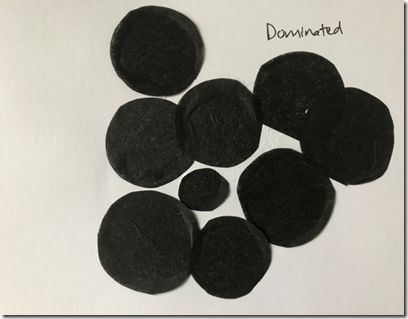
image Image 7.1 – Different types of dissolvable backgrounds.

I cut pieces of the various dissolvable backgrounds, stretched them in a hoop and stitched a sample about 1.5 inches square using the same pattern of stitching in each.  I then cut the samples out and dissolved the base fabric.  The results were then dried and attached in my sketchbook, see image 7.2 below.

image

Image 7.2

Sample 1:  Light weight soluble film from Art Van Go.  This is a very flimsy surface, a bit like cling film.  It was easy to stitch into and moved freely over the stitch plate, but started to rip in places where I stitched heavily.  It can be drawn on with biro, but because it’s flimsy it moves when drawing on it and I suspect a wetter ink may dissolve it.  It dissolved well and left no residue.   

Sample 2:  Heavy weight soluble film from Art Van Go.  This is a stiffer transparent material, about the same weight at as the 10p carrier bags you can buy in supermarkets.  When stitching it snagged on the stitch plate a bit as it is slightly rubbery.  Similarly, it sometimes felt as though it was sticking to the needle and, for these reasons, it wasn’t as pleasant to stitch as the lighter film.  It took the stitching well, with no ripping.  Can draw on it easily.  It dissolved easily leaving no residue.   

Sample 3: Vilene Solufleece.  This was a product that I have had for a few years, and was bought from a sale of a deceased artist’s materials so I suspect it is quite old.  It looks, and feels, like a lightweight interfacing and is quite flimsy.  Maybe I didn’t have it tight enough in the hoop, because it puckered during stitching, as can be seen from the shape of the final piece.  Possibly doubling the fabric up may resolve this so that the hoop grabs the layers better.    As this was old fabric I wonder whether it had deteriorated a little which made it less effective to use.  Can draw on it but not as easily as other samples as it is slightly fluffy, and is not transparent so can’t trace a pattern easily.   It dissolved easily leaving no residue.

Sample 4:  Dissolvable cold water fabric from Art Van Go.  This was a similar weight and feel to the Vilene but it was more pleasant to stitch.  It moved well over the stitch plate, held its shape and didn’t rip at all.  Can draw on it but isn’t transparent so can’t see a pattern beneath it clearly if you wanted to follow one.  It dissolved easily leaving no residue.

Sample 5:  Aquatics Romeo soluble film.  This is a stiffer transparent material, very like that used in sample 2 (maybe the same thing that Art Van Go package themselves?).  As before,  it snagged on the stitch plate a bit as it is slightly rubbery.  Can draw on it easily.  It dissolved less easily than Sample 2 and left a residue.  It would have taken quite a lot more agitation to remove the residue which may have damaged the shape/stitches, but would be good if I wanted to make a 3D shape.

Sample 6:  Aquatics soluble paper.  Quite a stiff paper, similar in weight to 80gsm copier paper.  It took the stitching well with no puckering or ripping.  Can draw on it easily but is not transparent so, again, not great for tracing a pattern.  This was the worst for dissolving; it left a heavy residue which was visible in the stitching, but would be good if I wanted to make a 3D shape.

Samples of soluble lace using different stitch methods

image

Image 7.3

image

Image 7.4

Image 7.3 shows a variety of samples made using different stitch types on my favoured surface, the soluble fleece, as shown in the key in image 7.4.  This was a key suggested by Sian.  This experiment was useful to show me how different types of stitch work with the soluble fleece.

image

Image 7.5:

Sample 1 – with  trapped pieces, held together well.  Sample 2:  very dense stitching, created firm piece that kept its shape, but looks like fabric rather than lace.

image

Image 7.6: 

Sample 3 –  cord trapped and stitched into hoops.  Held together well.  Sample 4 – pre-set decorative machine stitch.  The shape of the stitch worked well but would have benefitted from being slightly more joined up.

image

Image 7.7:

Sample 5 – loose and held together surprisingly well, partly because I left some residue in place when dissolving.  Sample 6 – lines of zigzag stitch created a rope type effect.

image

Image 7.8

Sample 7 – dense edge with looser centre – held together well and creates a natural frame allowing for a very loose lacy section.  Sample 8 – lots of trapped treads overstitched loosely…a bit of a mess!

image

Image 7.9

Sample 9 – dense stitching in circles. created a 3d effect, and could be made more so with further stitching.  Sample 10 – metallic thread in dense stitching –contracted a lot when washed and created a matted effect.

I then used some of these techniques to create some lace samples based on my sea and sky drawings from Chapter 1 as shown below.

image

Image 7.10 – Drawing image

Image 7.11 – metallic thread on solufleece.  Stitched in a hoop.Free embroidery with feed dog dropped.  The metallic thread worked well to recreate the colours, though they don’t show particularly well in the photograph.  The gaps in the stitching represent the white areas in the drawing.  It held together well on washing.

image Image 7.12 – drawing

image Image 7.13 – Aquabond with trapped pieces under light film.  Whip stitch with normal machine thread.  Sulko thread on top.  Free embroidery with feed dog dropped.  Held together well on washing.  More white stitching required to better represent the drawing and areas of heavier blue stitching patches loosened up when washed and lost some of the depth of colour.

imageImage 7.14 – reverse of sample 7.13 – lovely effect!

image Image 7.15 – drawing

image Image 7.16 – Solufleece.  Pieces of scrim and linen trapped under stitch.  Free embroidery with feed dog dropped.  Various weights of thread.  Held together well on washing.

image Image 7.17 – drawing

image Image 7.18 – sample before dissolving – whip stitch created speckled effect.

image Sample 7.19 – Aquabond andf light film.  Netting trapped.  Free embroidery, dropped feed dog.  The Whip Stitch effect was lost when the fleece was dissolved.   Held together well despite loose stitching due to netting.

image Image 7.20 – altered photo image Image 7.21.  I forgot to take a photograph prior to dissolving, but it looked much better than this!  Aquabond and light film with scraps of silk and netting trapped.  Free embroidery with feed dog dropped.  Prior to dissolving, the trapped pieces were in wave shapes, like the drawing.  Unfortunately, it didn’t hold together well as there were too many sections that weren’t connected by stitches.

I think that I had very mixed results with these samples, but learnt a lot from the process.  The stitching needs to be loose enough to get the lace effect, otherwise one may as well be stitching onto fabric, but not so loose that it looses shape on dissolving the fleece.  Stitch effects such as whip stitch are lost once the fleece is dissolved because there is nothing to hold the loops in the thread.  

Module 6 – Chapter 6

Before starting Chapter 6 I did some more thread dyeing to add to those done in Chapter 4.  I had ordered some dyes and white threads online which took weeks to arrive and so have added them in here.

image Image 6.1 – threads dampened and dipped in Procion dyes and left in a plastic bag overnight.
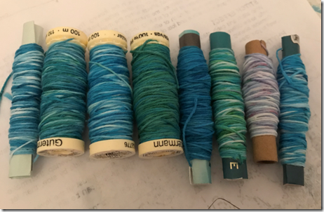
image Image 6.2 – threads dampened and sprinkled with Procion dye powder and left in a plastic bag overnight.
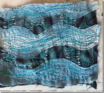
image

Image 6.3 – the final threads.  Those which had the dye powder sprinkled on them produced a more variegated, and in my opinion, attractive effect.
 

Cutwork

For Chapter 6 we were asked to select some of our designs from Chapter 2 and interpret them using cutwork i.e. using layers of fabric, adding stitched areas of textured machine stitchery, and cutting back or melting  back to reveal the surface below.

Sample 1

image

Image 6.4 – design from Chapter 2

image

Image 6.5 – layers 1 and 2.  Base layer of cotton with stitch on top.  Second layer of cotton lawn, stitched and cut away.

image

Image 6.6 – Third layer added – cotton muslin, stitched and cut away.

image

Image 6.7 – the final piece compared to Chapter 2 design.  I think the directional stitching worked quite well on this piece to represent the flow of the shapes in the paper sample.  However,  in retrospect, I see it needed more white pieces as a top layer to give the disjointed appearance of the paper sample.

Sample 2

image

  Image 6.8 – digital design from chapter 2

image

Image 6.9 – base of dyed muslin painted with white gesso and machine stitched in circles.

image

Image 6.10 – layer of Shibori dyed cotton added, stitched in circles and cut away

image

Image 6.11 – layer of synthetic Organza added, stitched in circles with cotton (non-melting) thread.

image

Image 6.12 – top layer melted with a heat gun

image

Image 6.13 – the heat gun had a transformative effect on the sample.  Not only did it melt the top layer, but it also caused the acrylic gesso on the base layer to pucker, creating a wonderfully irregular surface.  When viewed in image 6.13 I think it gives a strong impression of a stormy sea with frothy waves.

image  Image 6.14 – the final piece compared to Chapter 2 design.  I was very pleased with this sample.  the various colours in the fabric layers represented the blues in the digital sample well, and the molten fabric and stitch created strong circular shapes.  The bumpy texture added to the effect by creating areas of light and shade.

Sample 3

image

Image 6.15 – digital sample from Chapter2

image

Image 6.16 – Calico base stitched with zigzag pattern.

image

Image 6.17 – layer of cotton – cut away; then a layer of synthetic fabric cut and melted at the edges.  I really disliked this sample at this stage and was thinking of abandoning it!

image

Image 6.18 – two layers of synthetic organza stitched and melted away.  The top two layers rescued this sample in my opinion.  They softened the harsh edges of the shapes underneath and created a fluidity to the piece.

image

Image 6.19 – the final piece compared to Chapter 2 design.  I was pleased with the shapes, colours and textures in this piece.  I think the finger-like shapes in the design are clear and the range of background colours and shapes has worked well.  The molten top layers have given height to the piece where they curled up around the stitched curves. I think this piece also has a strong ocean-like appearance; like the froth of the tide on a beach.

Sample 4

image

Image 6.20 – paper sample from Chapter 2

image Image 6.21 – Shibori cotton base (reverse side used) with dyed and printed muslin stitched on top in a grid.

image

Image 6.22 – muslin layer cut away

image

Image 6.23 – top layer of white linen cut, frayed and stitched in swirling lines using blue machine thread.

image

Image 6.24 – the final piece compared to Chapter 2 design.  I think the variety of colours are well represented in this sample, and the frayed threads work well as the printed white lines on the paper version.

Sample 5

image

Image 6.25 – digital sample from Chapter 2

image Image 6.26- Base of dark cotton with pale blue linen.  I wanted a flat, graphic appearance on this piece and so added lines of stitching to form a grid.  I cut the linen away in irregular shapes.

image Image 6.27 – top layer of cotton lawn added.  Stitched in a larger grid and cut away in geometric shapes.

image

Image 6.28 – further vertical and horizontal stitch lines added to accentuate the shapes.

image

Image 6.29 – the final piece compared to Chapter 2 design. I am very pleased with the way that this sample has worked to represent the shades of the blue colours and the white geometric shapes on top.

Sample 6

image

Image 6.30 – digital sample from Chapter 2

image Image 6.31 – base layer of dyed and printed fine linen.  Layer of dyed muslin stitched on top and cut away.

image

Image 6.32 – layer of linen printed with gesso added, stitched and cut away.

image

Image 6.33 – cotton lawn stitched with lines of zigzag, cut away.

image

Image 6.34 – layer of silk added and cut away.

image

Image 6.35 – final sample compared to Chapter 2 design.  I think the size and variety of colours works quite well in this piece and the top layer of blue stripes (see image 6.30 above)  represent the digital design quite well.  A greater contrast in the shades of blue would have improved this sample.

Module 6 – Chapter 5

Free machine stitchery to interpret drawings

I chose a selection of my drawings from earlier chapters and tried different machine stitch techniques and materials to interpret the drawings.

image

Image 5.1 – marks made in pencil, ink and pastel

image

Image 5.2 – backing of calico; lines of stitch using a programmed design of wavy lines; waves of lines created using satin stitch size zigzags with bobbin thread very loose – this created the black dotted lines; couched sandy coloured yarn for the pastel marks.

image

Image 5.3 – frottage using oil pastel over mesh image

Image 5.4 – calico background; neutral top thread and navy bobbin thread very loose to create whip stitch dots.  I fiddled about with the tension quite a bit to get the effect of the bobbin thread showing as small circles to represent the dots.

imageImage 5.5 – inks and oil pastels image

Image 5.6 – Felt background with wool fibres needle felted onto it.  Cable stitch with blue top thread and perle in the bobbin; then couched thicker orange cord on top; then machine stitched French knots by winding thread around the needle (see image 5.7 below).image

Image 5.7 – machine French knots

image Image 5.8 – wax resist and inks.  It took me a few attempts to represent this image as shown below.

image

Image 5.9 – printed scrim over dyed fabric base; heavy machine stitching with sections left unstitched.  There wasn’t enough contrast between the stitched and unstitched sections to represent the white parts of the painting.

image

Image 5.10 – Silk tops on calico base.  I attempted to machine stitch sections but gave up quickly as the silk disintegrated and kept catching on any rough bits on my hands.  It was extremely unpleasant to work with. 

image

Image 5.11 – this attempt was more successful.  Base of dyed linen; whip stitch with white thread; bits of grey yarn trapped at edges of the white sections; whip stitch with grey top thread and navy bobbin thread to give mottled effect which represents the wax resist quite well.

image

Image 5.12 – oil pastels and inks image Image 5.13 – cotton lawn base coloured with acrylic ink on Bondaweb.  White layers built up from transparent fabric (see 5.14) edged with whip stitch using white top thread and blue bobbin to give speckled edge;  bottom tension loosened more and whip stitch in dark blue for dark patches.

image

Image 5.14

image

Image 5.15 –  inks and paintsimage Image 5.16 – cotton muslin dyed with Procion dye then printed with fabric paints; long zigzag with loose bottom thread in three colour combinations:  blue top and bottom; white top and blue bottom; blue top and white bottom.  Knotted thread couched on top; bits of thread woven through the stitched lines and tied off.

 image

Image 5.17 – acrylic paints image

Image 5.18 – linen with Procion dye blobs; zag zag cable stitch using various thick threads in the bobbin.

 image

Image 5.19 – oil pastel and inks image Image 5.20 – Cotton muslin dyed with Procion dye then printed with white gesso.  Cotton rings made by drawing threads from linen and zigzagging over them (images 5.21 and 5.22); trapped pieces of dyed organza; straight stitch on top with yellow, orange and pink threads.

image

Image 5.21 – drawn threads

imageImage 5.22 – drawn thread circles

image

Image 5.23 – acrylic paints and oil pastels image

Image 5.24 – organza printed with painted bondaweb; cable stitch using perle thread in bottom bobbin, some in straight stitch and some in zigzag.

image

Image 5.25 – verification photograph of me working on Module 6 taken by Sian Martin at Ammerdown, May 2018.

I was pleased with most of these samples.  Whip stitch proved to be a very useful technique for creating quite painterly marks with mottled surfaces or broken edges.  I became quite adept at working with different tensions in both the top and bottom threads during this chapter.